Episode 72
Style Guides with Anna Debenham
June 5, 2014
Style guides, once the exclusive domain of print designers, are finding their way onto the web. Built out of HTML and CSS, such style guides are handy tools for the design process, for maintaining sites over time, and for making collaboration across teams much easier. Anna Debenham joins Jen Simmons to explain.
It's not just something that you hand off to the client and that's it. The intention is that anyone who works on the site, if new features are built, if new components are built, then they go into the style guide.
Transcript
- Jen
-
This is The Web Ahead, a weekly conversation about changing technologies and the future of the web. I'm your host Jen Simmons and this is episode number 72. I want to first say thank you so much to today's sponsors, we have three of them today: Media Temple, Squarespace and the Velocity Conference.
So today on the show I have here Anna Debenham. Hi, Anna.
- Anna
- Hey Jen.
- Jen
- I just saw you in person, actually, for the first time.
- Anna
- Yeah, you came to Brighton a couple of weeks ago.
- Jen
- Yes, and we met up in London. We went to a fancy event and dinner. The Net Awards. Which you've won once. You won young developer of the year last year, didn't you?
- Anna
- Yeah.
- Jen
- That's very exciting. You're also a technical editor for The List Apart and a co-producer of 24 Ways. Also very impressive. And of course the most impressive thing that you've maybe ever done is that you were on The Web Ahead. [Both laugh] I'm sorry, I mean, also, you were on The Web Ahead, episode 38. Which seems like a really long time ago now.
- Anna
- Yeah, it feels like a really, really long time ago.
- Jen
- That's almost half as many episodes ago. Where you talked about game console browsers because you were doing all sorts of amazing research around game console browsers. But we're not going to talk about game consoles today, I don't think.
- Anna
- Maybe a bit.
- Jen
- Yeah, maybe a bit. But you wrote, recently, more recently you've written a book about front-end style guides. So I thought it'd be great to have you on the show to talk about style guides. It's a topic that's come up before. Because I've talked with, I forget who exactly has brought it up, it just seems like one of the reoccurring themes. Talking about designing in the browser, talking about, like, what kind of tools are available for people to do web design beyond using something like Photoshop. People seem to be saying, "Hey, I still totally want to use Photoshop but we need other tools as well." I think Jeremy talked a little bit about one of the techniques he uses, on the first time he was on the show, and Aaron may have talked about it when he was on the show, about how he designs. I'm sorry I didn't write down the other, there are other times it's come up. Samantha Warren was on the show talking about style tiles. Specifically about her little thing and style tiles. But I wanted to find out what you think and hear some of the stories. Samantha was episode 28. Hear some of the stories about the projects that you've worked on in the UK and probably clients all over the world. And your experience. How do you think of, when you think of the word "style guide" in the context of web design, what is it you're thinking of? What is it?
- Anna
- Well, it's kind of a broad term. I mean, it used to be that a style guide, in the design sense, was something that talked about the typography that you'd use in print and colors and things. Back, years and years ago, I was working on a project and they gave me their print style guide and it was all about Pantone colors and typography being in points and I had to try to translate that to the web. And I thought, "Why can't we have ones that are specifically designed for the web itself?" And so a few years later I was interning at Clearleft and they did something sort of similar. They created these things called Pattern Portfolios, which were basically style guides but for the web and they used them as deliverables for their clients. Kind of from there it really evolved so now when people talk about style guides for the web, I think of things like pattern guides. It's bits of code alongside the pattern itself. So, like, modules of features and things like that. That's what I think of when I think of style guides. I think it's kind of evolved quite a bit.
- Jen
- Yeah, because it used to be, "These are the rules around how to use our logo." Like, here's a picture of the logo used in color. Here's what you should do if it's black and white. Here's an alternative style for the logo that's allowed. I think as a "brand," the idea of what a brand is has evolved to be more than the logo, I'm seeing a lot around, if all of the graphic design treatment that's going on for your project, company, whatever, is part of your quote-unquote "brand," then how can you come up with a guide that people across your organization can use to create and maintain consistency and sort of make sure that things always look the same? Especially if you have a really big team. Especially if you've got thousands of employees and everybody's supposed to be doing a little bit of graphic design. How can you tell people, "Hey, this is how you should do it"? But then it's very interesting to think about that being out ion the web, too. Let's translate that into CSS and let's actually write some CSS that's re-usable and say, "Here's a headline treatment," "Here's a side thingy on the side treatment." What do you think is a tip that people don't know about? Or how do you approach, in the projects that you've worked on, how have you approached creating a style guide maybe apart from being like, "just do it!" What do you think is the process of going about creating one of these?
- Anna
- Normally, I sort of build them as I'm building a site. Someone will come in and say, "We need a website redesigned." What I start off with is sort of a boilerplate. It's basically a page that contains links and text and headlines. All of the different HTML elements you might get on a page. Things like forms, tables. This sort of thing, it often gets missed unless a mockup has that element on it, it often gets missed out of the design and then you end up with the default browser style. It looks kind of ugly. Often I've been working on a site where there's no table design because there were no tables in the mockup. So, yeah, something like that. Having a kind of page where you've just got normal HTML and being able to apply a stylesheet to that really early on. I find that really helpful.
- Jen
- It sounds like it gives you the default. Like, ok, we know there's all of this stuff in HTML. There's the potential, in the future, at some place, on this website will have a table. Or will have a form with this kind of drop down or this kind of button or will have a hr. A rule. What does the hr stand for? I just know it as hr.
- Anna
- Horizontal rule?
- Jen
- Horizontal rule. [Both laugh] Or will have a pager where people will click a bunch of numbers with little arrows next to them to go from one group or items to another group of items. And yeah, just to say, "Hey, let's just start with rewriting all of the default browser CSS styling." Especially when you're doing something like a theme for a CMS is when you sort of approach a project like that. Thinking, "Ok, what are all the things that need to get styled?"
- Anna
- Exactly. And I like to sit down with a designer right at the start of a project and just have that kind of page. And to be able to apply the CSS with them. Sometimes the designer will know CSS so they can tweak the typography, they can tweak the line height, and that's really, really nice. That starts a really good conversation off. As well, we get to test things like web fonts really early on. I was on a project where the web font we chose was actually really bad in Windows and we didn't catch it early on enough so it meant at the end of the project we had to switch the font that we were using and it caused all sorts of issues because it was a different size, it just meant that we had a lot of problems later on. If we'd started off in the browser with that page I thin we wouldn't have had that. Because we'd be able to test on different devices, on different screens, and seen what problems were lying ahead.
- Jen
- It also means you could take that page, put it in a whole bunch of different devices, and then make a decision about, "Do we like this font? Do we like this color? Do we like this treatment? Is this size the right size given all of these different phones and all of these different resolutions?" Do you find that designers kind of understand this quickly? Or do you feel like with some of the designers that you've worked with, do people sort of get confused and feel like, "Wait, this is not the web page, this is a whole bunch of bits all chopped up separate from each other? What is this? This is not how I design."
- Anna
- I think I've been lucky with the designers I've worked with. They've all been open to learning new techniques and for them, you know, the ones I've worked with have been familiar with print style guides. It's not that different, really. And using something like Typecast, I don't know if you've heard of that.
- Jen
- Yeah
- Anna
- It's kind of like, it creates that page for you, and you can style it using a kind of WYSIWYG. But it spits out CSS so it's good for the designer because they don't have to be coding. But it's good for the developer because it generates the CSS. It's actually quite clean and nice.
- Jen
- Yeah, for anybody that hasn't used it, it's a place where, I mean, really it's a place to test type. Where you can, very quickly, select a headline or a paragraph or a sub headline and then change the typeface. And you have access to typefaces, basically, all of the typefaces at fonts.com. All of the typefaces at My Fonts. All of the typefaces at Typekit. Everything at Font Deck. Everything on the Google Fonts platform. So before you pay for anything, you can just kind of go through and be like, "Do I like this one? This one? This one? No, no, no, no, no." Until you find, "Oh, actually, I like these 3 different." And you can make alternative versions and set them up side-by-side and be like, "Ok, I like these 3 different headlines. I think. Maybe I'll mix it with this body font. Oh wait that doesn't..." And you just keep playing and playing and playing and it's all in the browser and then you can publish it and you can test it on a bunch of different devices. You can show it to people on your team or your client or whoever's making decisions. It's really quite amazing. And it was a startup that just was like, "Wow! We need that!" And then they got bought by... Monotype, right? Which made me really nervous. Like, if one font company buys them, they might eliminate the coolest feature of all, which is you can test all these fonts from all these different companies. But then they didn't do that. They actually made it more awesome and more powerful and, yeah, anyway. A little plug for them. A little free plug. It's a great tool. It's a subscription tool so you've got to pay for it, but hey.
- Anna
- I can spend hours in it just picking out fonts. [Laughs] Like this huge drop down just of fonts, and yeah. It's quite a time-waster. [Laughs]
- Jen
- Well, and you know, there are a lot of people who are developers in my time over the years, who sort of said, "I can't design" or "I don't know the first thing about design." And sometimes I think of myself, "What can I say in this moment to help them out and to encourage them to try more design?" I think part of it is that maybe the process isn't really known. That actually this is just a big part of the process. You sit in a tool like this, maybe this tool or maybe a different tool, and you just try something. And you kind of are like, "Do I like that? Do I not like that?" I guess that's maybe where... especially when I'm talking about visual design, graphic design. Over time, you can get a better eye and get a better sense of what you like or don't like or what you think is good or what you don't. There's some discernment there. But for anybody out there who feels like, "I would like to have more web design skills and I don't know how to get them." Just doing something like changing the font over and over and over and over and over and over and over and over again is the way. That's how I learned. I was doing it before the web, I mean I was doing it in Pagemaker, but that's exactly how I learned whatever it is that I know.
- Anna
- I guess Typecast would be a good way to learn CSS as well. 'Cause it shows you what's happening.
- Jen
- Yeah, and there are other tools showing up. Macaw is a really interesting one. I'll put all these links in the show notes. I haven't used it enough yet but it's also sort of a WYSIWYG that writes decent code. It's only that you can look at the code, I think, but it's that when you... like if you're using InDesign or Pagemaker or Illustrator or Photoshop or Quark Express. [Both laugh] If you are using Quark Express to do web design, for example. All the choices that are offered to you by all the menus are not web choices. They're like, you can pick this font but we're not going to render it. So you pick Georgia but it's Georgia that doesn't look like Georgia on the web. It looks like Georgia in print. There's no such thing as line height there's a thing called kerning and leading and so you set leading but leading may or may not be the same thing as line height and there is no kerning in CSS. It's sort of this, like, you're playing baseball but really what you're trying to learn is cricket or something. [Both laugh] You're like on the wrong field. So even the choices like bold or not bold... there's this thing in the web world where it's like, 100, 200, 300, 400... like, what is that? What does that mean? There's no such thing in print as setting your boldness to 400 versus 600 or ems.
- Anna
- And the canvas.
- Jen
- Yeah. And then, of course, having a fixed edge canvas. I like these tools where the choices that you've given in the drop down menus are web choices. And the things that are rendered are rendered like it's the web. Because even if you're just getting started, I think it helps you learn a literacy without even realizing it, that translates. Anyway. I feel like I keep ranting about the same thing over and over, so apologies to the listeners. [Both laugh] Like, you've got the point, right? You understand that I like this stuff so I'll stop right now.
- Anna
- Well, back when you did the episode with Jeremy and Samantha, I must have listened to them about 3 or 4 times, I was so excited. It's where I got a lot of my ideas from, when I was writing. I wrote a piece for 24 Ways on style guides and I quoted, I think Jeremy and Matt, from things he was saying in the podcast. So, yeah, the rants are useful. [Laughs]
- Jen
- It's always new to somebody. That's what I feel like. There's a teacher in me that wants to remember the newest students. So talk about your book. What is in here? If somebody were interested in buying it, who does it speak to, what kinds of things would people learn by reading your book?
- Anna
- It's really for people who have, you know, they've come across problems. Say they're a contractor like me and they go into a company and they're asked to build a new feature. They start building it and then they discover that, this feature's already been built, it just wasn't documented anywhere. It kind of goes into how to build a style guide from scratch but also how to build one if you've already got a site and how to sell it to the client, really.
- Jen
- Let me jump in here with a sponsor and then I want to ask you about the snake-mess of code and how this technique can help prevent snake-messes. I think I'll start with a new sponsor today. The Velocity Conference. Velocity is a conference that's put on by O'Reilly. They have several a year actually. There's 4 of them. When you go to their website, velocityconf.com, you can see. June, August, September and November, they'll be in Santa Clara, Beijing, New York, and Barcelona, Spain. But the one they want us to talk about is the one that's coming up the soonest, which is June 24-26 in Santa Clara, California. Santa Clara, if you don't know, is next door to Cupertino, Sunnyvale, Mountain View, it's right there in the valley, kind of next door to San Jose, south of San Francisco. Next door to Cupertino is always cool to me. This conference is big. A lot of the conferences are nice and big and tones of options of things to go see, check out lots and lots of speakers. And Velocity is centered around operations and web performance and making sure that your application, your web application, or your website is running smoothly. Something that we've talked about a little bit on The Web Ahead but not a lot. because it's a little bit on the side of the world that I don't quite understand. But you can learn at Velocity what's important to monitor and how to understand the metrics that you're gathering to make a difference. To see how some of the world's largest websites deal with configuration management, failover downtime, best practices and other key issues on the operations side of the web. Make sure your web thing doesn't melt, basically. And performance. How do you measure success? How do you figure out how many milliseconds you should have? What kind of budget might you want to have for speed? And what are that latest tools, technologies, and expert advice on getting your site to perform at warp speed? There's also a lot about mobile and how all of this might be slightly different, or not, for mobile performance. Cultural ad organizational change and how to shift the culture of your company if that's needed in order to focus on performance and operations. To make sure that you're able to deploy quickly and have everybody on board. And the big picture, to just understand some of what the best minds in the field are thinking about, with keynotes and sessions and exhibit hall networking opportunities. So you can check out what they have at velocityconf.com. And, here we go, this is a first time ever for The Web Ahead. They are giving the listeners of The Web Ahead... I have a ticket. I have one free 2-day pass which is valued at $1,625 that I'm going to give away for free to one of the listeners of this show. So if you're interested in winning this ticket... now, of course this does not include any sort of airline flights or hotels, so you have to know that you are, in fact, going to be able to be in Santa Clara June 24-26 and that maybe you live there, right? That would be ideal. Or maybe for some other reason you could totally get yourself there. You should. This is how we're going to do it. We're going to do, like, write up a little web performance speed tip. Maybe a blog post. Maybe a post on some other kind of network, even a Tweet. Maybe you need longer than a Tweet to do it though. And drop in the hashtag #fastwebahead. Hashtag #fastwebahead. And I will look at all of the speed tips, web performance speed tips that people suggest. You also can, like, just go read that hashtag and see all the web performance speed tips that everybody has. The listeners of the show, sort of collective wisdom of the show. But I will read them all and then chose one. Whichever is sort of the best tip or maybe it's a bit of code or maybe it's a strategy. Don't think that there's a certain formula. You can do something interesting or different. And then that person will win. You have until, I'm going to give everybody until midnight, June 15. Midnight, Sunday, June 15. In whatever time zone you're in. Midnight, Sunday, June 15. To submit your tip, your suggestion, and then I'll pick a winner on the 16th and then the conference starts on the 24th. So if you win, you'll just have a week to figure out how to get there. Which means, people who are listening to episode 72 and people who are listening to episode 73 will be able to participate if you are listening before June 15. What else did I need to tell you? Oh, you can also just email me. Like, @reply @thewebahead. Follow @thewebahead on Twitter and you can ping me there and make sure that I see your little thing, whatever it is that you make. Maybe you make a bit of code and you put it on CodePen or something, right? It doesn't have to be writing, it could be all kinds of things. Or you can email me at jensimmons.com/contact and say, "Hey, go check out my thing." Doesn't really matter to me how you find me. Just somehow make sure I find it. And that's it. Thanks to Velocity and O'Reilly Media for supporting The Web Ahead. Check out their conference if you're at all interested in web operations and performance, this is really the place to go, to just get 2 or 3 days of intense knowledge dropped into your brain. Thanks.
- Jen
-
Speaking of performance and optimization... [Both laugh] It's easy, especially on a big project, for the code to get completely out of control. I know a lot of people are using object-oriented CSS, like Nicole Sullivan suggests. Or there's some other, kind of branded, like, "Oh, it's called SMACSS, it's called this, it's called that." These techniques around, let's not just write custom code, directed custom CSS, directed at each and every little thing on the page. Because that just gets to be more and more verbose, messier and messier. Let's figure out a way to organize, especially if you can figure it out from the very beginning, how to organize our CSS and reuse the same styles over and over and over again. We'll get a more consistent result and we'll have... when something new needs to get built, we'll have a quick way to use CSS that's already half written.
Do you do that? Is that part of what you're thinking about when you're creating a style guide? How do you... how are you thinking about deploying the CSS in the style guide in a way that makes things more efficient? Is that part of what you're thinking about as you do it?
- Anna
- Yeah, I think things like object-oriented CSS and all these things, they fit really nicely with style guides. I use SASS. For each component I create its own SASS file. In the end I have an elements folder which is just full of SASS files for each feature. I have another folder which has the HTML for that feature. So to find the HTML and CSS for a specific component, it's all kind of named the same. And it keeps it separate. It means that if a client decides they don't actually want that feature, or they want to add a new one, it's really easy to slot them in.
- Jen
- Is it also then... I would imagine that you end up... I mean, people love Twitter Bootstrap. But in a way, I think it's kind of cool to make your own Bootstrap.
- Anna
- Yeah, I think it's good to make your own just so that you can kind of understand what's happening. It helps you build in a way that is really maintainable as well. Have you seen Brad Frost's Pattern Lab?
- Jen
- I have but talk about it. Explain what it is.
- Anna
- That kind of goes hand in hand. He talks about things like elements and atoms and, oh, I forget what the terms are.
- Jen
- Atoms, molecules, organisms, templates, pages.
- Anna
- That's it. Yeah. He talks about how they all kind of... like atoms turn into molecules, which turn into elements... I can't get it right.
- Jen
- ... Organisms. I only know this because I'm looking at the website right now.
- Anna
- It's so hard to remember after a long day. He creates these elements out of all these specific parts and it's just a really nice way of doing it because it means you can mix and match. You can create things out of other things. So you're not constantly reinventing the wheel, you're not rewriting stuff all the time. It outputs it in a really nice way as well. He's got, it's basically a pattern library which shows all of the components in context. And you can also press buttons that squish the page, all these sorts of things. It's really clever.
- Jen
- I think there's a way... I mean, for awhile there we really imagined that a webpage, the web is a series of web pages. And that each web page, if you're designing a website, what you should do is design the page. So what do you do? You start with designing the page for a blog post and then you design a landing page for that. And everything seems to be so focused on the page. It feels like both in a lot of the rethinking of content and the work that Karen McGrane, who's been advocating, and Jeff Eaton as well and a bunch of others, around, like, don't think about your blog post as a blog post webpage. Think about it as content that goes to a system and is structured in a certain way and that it comes out in a lot of different ways and one way that you might see that particular content is in a page structure. But it also could be in a RSS feed. It could be in a JSON feed that goes into an app. It could be on a different type of webpage. It could be in a list webpage. It could be in a summary webpage. That this is sort of the same thing for visual design stuff. To say, don't just think about a whole page and open up a fixed window program, a program that draws pictures that are a fixed size. But think about it as a whole system and you're going to design what... Nicole Sullivan has talked about this a lot, too. For her, for writing the CSS, write the CSS for... what was it she called it? Like, a media object. There's a photo that's a square thumbnail, next to a headline, next to a little teaser, with a box around it. And you could design that object. Not just how headlines look and not just how the text and the teaser looks but how the headline and the teaser and a small thumbnail go together visually and how they get... what kind of treatment do they get, visually? How do they look like a little unit, as a visual unit? That could show up anywhere and that could get reused over and over again. For her, that she would write a certain set of CSS to style that and put just a simple class on it and then anytime you want ever want that pattern you just apply that class any place and all the things, if the markup matches what it needs to be, all the things inside of that particular container of markup are going to get that particular style. If you need, maybe there's a main one and then there's two alternative ones, the main one has a white background and the other one has a blue background and the other one has a brown background. Maybe something's a little different. That you could just have the original class and then you just have a couple extra classes that add a little bit of overriding, a little bit of alternation to it. What you're doing is, you're building... and this is I think Brad's idea around an atom as a unit of construction. Atoms, in physics in the real world, gather together and they make molecules, and then those gather together and they make organisms. So you're thinking about your whole system and you're thinking about, not just the page but all of the things and you'll have this over and over. You'll have this media element over and over. I mean, when Nicole did her presentation, she was just pointing it out. "Look, on Facebook, it's a thumbnail with a headline and a teaser. And look over here on this other website, there's a thumbnail with the headline with the teaser. You look on the New York Times dot com homepage, there's a thumbnail with a headline and a teaser." Like, that pattern we see everywhere, so why not, if you're going to use that on your project, why not come up with a design for that? It leads a little bit into style guides as well. You could design just that as part of your style tile. You could, before you figure out the whole page, you can start with designing smaller units like that. You build up your visual design, your style, guide, rules, your code, your production code as well as perhaps the design code that gets thrown away. You're making a system, you're not making webpages, a stack of webpages.
- Anna
- I think it's really good for the designer to think about that as well. I don't get it so much now but before I used to work on sites and I'd be given lots of page designs and a heading would be different but for no apparent reason. It would get kind of... It wouldn't have any rules. It would be really hard to write CSS because I wouldn't know why it was like that. Whether it was a mistake, whether the designer had changed it later on but forgotten to update that template. If you can think in terms of, "What is this?" And why, what is the rule for this? It's why I like working with designers who know CSS, because they think in this way. They'll think about systems and structure and rules. When you create a style guide, you think of everything in terms of components and where it's going to slot in and how it could basically live anywhere on the site. You can't restrict its width, it's got to be able to fit anywhere. It helps you think about responsive design. It helps you think about systems and all of these different things. I've found that it's helped me with making my CSS more object-oriented because I'm thinking in terms of components rather than pages.
- Jen
- Yeah. I mean, the web's not a stack of index cards even though we first imagined hypertext as stacks of index cards. The HyperCard was literally a program where you looked at pictures. Fake, gooey, computer renderings of stacks of index cards. That it's actually not stacks of pieces of paper. I should jump in with our second sponsor.
- Jen
- Anna
- And they've got that cloud player thing, too.
- Jen
- Yes, they do that cloud player thing. I haven't quite figured out... I haven't set it up on everything.
- Anna
- I think you just press a button and it turns it on and makes the site fast. [Both laugh] It just caches stuff. I don't know, it's some sort of magic. But it just makes it more reliable.
- Jen
- Makes it faster.
- Anna
- Yeah, and doesn't go down as much. It didn't go down before but it's... I guess it works if it hasn't come down.
- Jen
- We talk a lot about this with performance. The different between something taking 3/4 of a second or maybe a second and a half to load, versus taking 1/10 of one second to load... can really make a big difference. Some people are really into performance and dev ops and all that and those people are awesome. Some of us [laughs] just want to click a button, a magical organ button that we're not sure about and just have it work.
- Anna
- Press the button! [Both laugh]
- Jen
- Yeah. I mean, this grid service especially is much more that. You just want to press the cool orange button with the cloud flair flashing super-fast whatever lightning bolt whatever zip zip thing that's on there. Done. You don't have to worry about it. [Both laugh] So, yeah, that's what I like about them. And their support system, I mean, I have had problems. Mostly, usually, of my own creation. Especially before I understood what it was I was trying to do. It was really good. You can ping them and be like, "Uh, I just broke everything" and they're like, "Ok, here's what you need to do. Yes, we can help you with this part. Ok, this part you need to go figure out by yourself." But they've always been very kind and very helpful so I really appreciate them. Check them out, mediatemple.net. TWA will save you 25%.
- Jen
- So, style guides. So tell us about some of your clients that you've had, the projects you've worked on, or also, maybe, the projects that you researched, that you found out about as you were writing your book? Like, what are some good examples of projects that have done this and won? Are winning, because they're doing this?
- Anna
- Probably the most public example, because a lot of the time I'll do this and the client won't want to put the style guide live, which is a bit sad because then I can't show it off. But Code for America. I worked with them on a redesign of their site. What they wanted was a system, they specifically wanted a system that they could build upon that would evolve over time. I worked with Clearleft and we built a pattern library which was basically a style guide and it had lots of components that they could use. It had all the code so they could just copy and paste it. We built it in Jekyll which is a kind of flat file system framework. That means that anyone, because they've got hundreds of contributors, and all types of different skills, and they just wanted something that was really easy to collaborate on. And it also lives on GitHub so people can just edit flat files. They were brilliant clients, they were really fun to work with and a pattern library was exactly the right thing for them.
- Jen
- It seems like especially if you have a project, as a client, where you've got multiple people, you've got unlimited budget, it's going to be around for several years, there's a way in which I think we've learned 20 years into making websites that if you don't do anything about that situation, you're going to end up with a mess. And it's just going to become a bigger and bigger mess that's harder and harder to grok. When new people arrive to work on the project, they're just, like, pulling their hair out.
- Anna
- Yeah, that's usually me.
- Jen
- Yeah! You're like, "Who wrote this code and why did they write it like this and what am I supposed to... I have to rewrite all of this. I have to start from scratch." It feels like the way to solve that problem is to come up with a system and build a system. And even though that system is probably going to take longer, maybe you could disagree with me on this, maybe it's going to take longer than just writing quick and dirty code really quick. You end up wit ha system that you then can hand off to junior folks or people who aren't web designers or web developers who just are tasked with working on the website. That they're able to then do things and do them in a very consistent way because they have the thing.
- Anna
- A project I'm working on at the moment, they already had a pattern library because it's a site that Clearleft built and they build them for all their clients. It's just been really easy. They'll send me some work and they'll say, "We need this module, we need this," and I'll go, I'll have a look through the style guide and see if there's anything that I can reuse. There's lots of code I can reuse as well. It's like having a little Twitter Bootstrap but it's all custom styling and their own HTML. Some of the work that's been estimated to take 2-3 days has taken about 2-3 hours. It's just been so nice. I've felt like, more motivated to keep up that kind of standard. Because the code's been so well-written, because things are all neatly ordered and it's just so much nicer to come into it and I know what's happening.
- Jen
- Do you feel like a big part of having a great style guide is to actually have a sort of mini website someplace with documents on it that display all of these items in a clear... and then for that website to then live, to keep going far beyond the design process?
- Anna
- Oh yeah, yeah. It's intended as something that is continuous. It's not just something that you hand off to the client and that's it. The intention is that anyone who works on the site, if new features are built, if new components are built, then they go into the style guide. What I'm doing at the moment is building kind of prototypes, we're testing some new features, new components, we're getting sign off in the browser rather than in Photoshop. Because those components, even though they're a bit different, they're kind of very similar to a lot of the style that already exists. I don't need to ask a designer to come up with a Photoshop comp. I can just work straight in the browser.
- Jen
- The reusability just makes things so much faster. It's one of the downsides of something like Photoshop is that you... if you want to change the headline font all over the site, it's really easy to... it's just laborious. It's just tedious. I have to keep going in and be like, "Ok, I thought it was going to be 24 points but we're changing it to 21." [Both laugh]
- Anna
- Yeah, that's exactly what I've been doing, actually. [Laughs]
- Jen
- Like, "Change this to 21. Now change this to 21. Now change this to 21." It's just like, yeah. [Pause] So what is hard about this? We've been talking about like, "It's the best thing ever," but where is it that you've had troubles or what's hard? What's the tricky downside?
- Anna
- I'd say maintenance is the main difficult thing. Even if you can sell the value of it to a client, it's mainly the development team that really like it because they see the value and the designers as well, they see the value of consistent design. But I do worry that when I hand a style guide over that it's not going to be maintained because I'm not going to be there kind of nagging people and telling them, "Just look in the style guide." But sometimes it's nice to come back to a project months later and they have been maintaining it. I think Code for America, they maintain theirs. That's always really nice. Because you know it's being used, that they find it useful and it's helping with some challenges that they have.
- Jen
- Yeah, I'm looking at the Code for America style guide right now. It's at codeforamerica.clearleft.com and this was, perhaps this was an earlier version of it. Or maybe this is the current version.
- Anna
- I think they've got it on their own domain actually. If you go on GitHub, have a look for their repo, they've got it there.
- Jen
- Yeah. And I'll put all of these in the show notes. The show notes for this show are at 5by5.tv/webahead/72. Some of these things, you know, you just have to see them. It's hard to describe them on audio.
- Anna
- I'll send you a link. I've got a big stash of style guides to show off. Ones that other people have created, also style guide systems, so tools that generate style guides. So I'll send you that link.
- Jen
- Nice. What are some of your other favorites?
- Anna
- One that I've seen quite recently is Lonely Planet. They write a blog post about how one of the problems that they'd had with style guides was maintainability. It was making sure that the code was consistent between the live site and the style guide. What they ended up doing was they created an API and that feeds in real content and it ensures that all of their patterns are up-to-date. I just think that's really, really cool. It won't be appropriate for every project. It does require some technical ability, it requires you've got the right setup, but I think it's a good thing to aim for.
- Jen
- Have you seen people make a style guide where the CSS that the style guide is using is actually the website's production CSS? Flag, like, "Hey, we're off track here"?
- Anna
- That's something that we discussed doing with Code for America. I really wanted it to be the same. But that just wasn't possible. I think in some ways it is nice to have it be different so that you can be testing ideas, but yeah. It's better to have them consistent, really. That's how I always kind of approached it, is by having it the same as the live site and then having maybe a separate stylesheet where you can test out ideas.
- Jen
- Yeah. It seems like something to talk through on a project. Like, should we go ahead and have this be a completely separate rebuild or should we try to overlap some stuff?
- Anna
- It's not always possible, but... if you can do it, then do.
- Jen
- Yeah.
- Anna
- And if you can put it public, as well, do, because it's really cool. [Laughs]
- Jen
- Yeah, Starbucks is the one, is one, that was getting a lot of discussion online when they posted...
- Anna
- Yeah, they did a really nice style guide. That's public and they do develop it as well, I've noticed it's changed over time. It's just really exciting that a company as big as Starbucks can make this sort of thing public because some of the clients I've worked with, they don't want to make it public, and I think that's a real shame.
- Jen
- It's interesting to see how these are sort of different from each other. Some of these, like the front page of the Starbucks style guide is just a list of a whole bunch of different elements and then you click on each element to see the design of that particular... thing. Where, like, I look at the Code for America one and I can... there's a whole bunch of things on one page. I can scroll through the whole page and get a bigger picture of what's going on.
- Anna
- I like to have them all on one page just so that I can see any conflicts in the CSS. If I've got a class name that's the same as somewhere else and I can see if it's overlapping, if some of the styles are inherited there. Also, I've done, at the top of the pages. It's something called Patchwork, which basically is the entire site again but rather than having the code examples, all of the components are slotted into each other. It's more realistic of how it would look on the site. And that's really good for device testing because you don't really want the code samples when you're doing testing. But it's really useful for when you're copying code across.
- Jen
- Yeah, that's really nice. So in the regular style guide view, there's all sorts of information about what things are as well. Like, here we go, here's the flag in black. These are the sizes. There's information about the stuff. And then when you switch to patchwork view, it's just the items themselves. It's just the buttons, it's just the form elements, it's just the headlines.
- Anna
- None of the kind of labels, none of the description of what it is.
- Jen
- Right. So this does look more like a crazy, makes-no-sense webpage. [Both laugh] Like a user would look at this and go, "What? Why are there 50 buttons all at the top of the page? That all say the same thing?"
- Anna
- It's also been nice because when we made the Code for America one public, some people started contributing. They were creating issues, mentioning bugs and things, it was just nice to be able to collaborate on bits.
- Jen
- Yeah. So Clearleft has a repo called Crate. Tell us about this.
- Anna
- This is something that they use on projects. It's really nice. It's more than just the pattern library, it's more than a style guide, it's got all of their contact details on it. They use it for clients. When they're building stuff, they'll have their crate, and in that will be all of the design comps, it will be the brief, maybe some presentations that they've done. Just everything related to the project so that if someone asks, "Can I see the latest design comp?" Then they can send them the link. And that gets updated all the time.
- Jen
- Nice. That's a great word.
- Anna
- I think they're building a redesign of it. They're working on improving it. So good to keep an eye on that.
- Jen
- Yeah, and it's all in a GitHub repo so people can... I guess really fork it and use it for... sort of radically change it and make it their own.
- Anna
- I've kind of been doing that myself.
- Jen
- And Jeremy I know had some stuff. I should find the links, but when he was on... I forget which episode it was now, but it was the very, very early. Let me look. Episode 3.
- Anna
- That's a really good episode. Definitely listen to that again.
- Jen
- In the show notes for that, there are links to his experiments and beginnings of tools or maybe they're quite evolved tools that he uses to build things like this. And when I'm working on a personal project with myself, not something for a big client, not something for a big development team, that ramp-up time, that sort of investment... it feels like an investment, you know? If you invest, you're going to save a lot of time later but if you don't invest, you have to put in the investment.
- Anna
- I think if you've got something already existing... if you've got kind of a boilerplate-thing that you can reuse, it saves a lot of time.
- Jen
- Yeah. Or even better, use somebody else's boilerplate. [Laughs]
- Anna
- Yeah, a good one is Paul Lloyd. He's got one called Bare Bones and that's on GitHub. I love that one. [Laughs] I'll send you a link.
- Jen
- Nice, I'm pulling it up right now. Yeah. "Style Guide Pattern Library"... form examples... here it is on GitHub. It's funny because part of what the ramp-up time is, is just to go through all these different ones that different people have made and figure out which ones you like best.
- Anna
- I like his one best because it's just so comprehensive. It's got so much. I mean, it's nice in that it's very unstyled but it's nice. He's really good at design so it's really well-designed. I also like Brad Frost's one. That's got a lot more components, things like carousels, the bits of a site that take quite a bit of time to build but you have to build them every time you work on a site. Whereas Paul's is more just HTML, raw HTML elements.
- Jen
- Part of what I do like about using tools like this is that is becomes a giant to-do list in a way. Where perhaps I'm designing a project and maybe I'm still waiting for content and I'm not really sure... you know, there's things that I'm just not sure of yet. I just don't have enough information yet. But maybe I have done enough work to figure out the typography, the direction, and I've picked some typefaces and I have some ideas around color and style and mood boards and what we're going for, what we want, what I want the graphic design to convey. But then I'm in this in-between place where it's too early to do whole things, like whole pages or the whole website. But we're beyond the basics. And it's like, ok, now I have a to-do list. I need to style forms, pagers, navigation tabs. If I'm working on a Drupal site, there's a whole bunch of Drupal things, that Drupal, whether you ask it to or not, it's gonna put a bunch of stuff out there in the world. There's going to be a more link, there's going to be a set of tabs, there's going to be a pager, there's going to be a...
- Anna
- There's going to be pagination.
- Jen
- Yeah. It's easy to forget some of those things until later and end up with a whole bunch of tickets after Q&A to be like, "Oh, right, we didn't style that. Oh, right." And somehow at the end it's such a drag. But at the beginning it can be kind of a springboard to get from, "I figured out two things," to "Oh, gosh, how am I going to figure out 2,000 things?" It's an intermediate. Just do a dozen. Here's a dozen things you need to do.
- Anna
- It's nice because when I was working on Code for America, I started with the designer on the same day. And I had lots to do because I had this boilerplate style guide and he was saying, "These are the fonts I'm thinking of using." So put them in and see how it looks on different devices. It didn't need to be staggered at all, our roles. Because we were working side-by-side. I think it really helps out development. It really helps being able to sit down with a designer, go through the boilerplate, and for them to go, "I don't like the default style of that, can we change that?" Rather than pestering them for mockups every few minutes.
- Jen
- I think there's something about separating these elements from each other instead of looking at the whole page. It's like it's easier to focus on, "Do we like the way we're presenting video, and the controls on this video?" Never mind the rest of the page. Just, do we like the way that that is going to function and work and look? Do we like the way that these, if we have a collection of thumbnails in a grid next to each other... this is the way we're going to style them all. To work with each other but separate from the footer or the header or the other major elements on the page. There are moments when it feels like you go into a meeting with a client and you really just want them to talk to you about the controls on the video player and the way the thumbnail grid looks. And yet they can't stop talking about the logo [both laugh] or the footer or the navigation. And you're like, "No no no no, I know! We're going to do that part later! Stop looking at that. I just want you to look at this one thing." And they just can't, right? If you actually don't present them together, if they're actually presented separately, then there's a way in which it's just dead obvious what the questions is and it's really clear what you need them to focus on. That can be quite useful at times. Both working with a client but also, like you said, working as a developer with a designer or working as a designer with yourself in your own brain. Sometimes you absolutely need to put things together to see whether or not they're going to work. But sometimes you want to focus on things separate from each other. This is part of the process that could help in the moments where you really want to focus on the things separately. Which is kind of weird. Some of these... like, I look back again at the Code for America pattern library. In some ways, it's weird to look at a button floating in space all by itself.
- Anna
- Yeah, you wouldn't get that normally but it is useful to be able to isolate it. Especially for bug testing. If you can isolate on a page, it's a lot easier to check whether it's that that's causing the problem or whether it's another component.
- Jen
- Especially when you are doing cross-browser testing in the first beginning. Like you said, to test the font on Windows and on every device and to see whether or not you want to change it before you get too deep. Or when you've built all your buttons and you like the way they look and they're fabulous and you've cross-tested them on a bunch of devices and then you put them on the regular website and it totally breaks. It gives you a clue about, like, "Ok, well, the base CSS is fine. What else is colliding and causing this problem?" Or you could double-check, go back to the style guide and say, "Oh, gosh. Ooo. That table really looks horrible on the production site." Or on dev, on our testing server. "Does it look horrible in the style guide? It does look horrible in the style guide. Ok, well, we clearly screwed up the style guide CSS."
- Anna
- Often it's been quite handy to see whether or not a problem is with the implementation, so the backend dev. Especially if I'm handing over code to be integrated into a CMS. Often things get missed and the dev will say, "This looks really broken here, you need to fix this bug." Then I'll bring it up on the style guide and say, "Well, look, it's fine here, it must be a problem. Maybe there's a class missing or something." So it's quite a nice way of checking whether something's... especially with Drupal. [Both laugh] Because Drupal has its own templates, it has its own stylesheets.
- Jen
- What are you talking about? [Both laugh] What do you mean, Drupal would insist on imposing some kind of other Drupal-y HTML and refuse to give you the HTML that you asked for? I don't know what you're talking about. [Laughs]
- Anna
- No, Drupal's perfect. [Laughs] I really annoyed a Drupal developer by telling him that the Drupal logo is a front-end developer's tear. [Both laugh] He's still annoyed with me about that.
- Jen
- I think I annoyed the entire Drupal community. [Both laugh] With my critique of Drupal HTML.
- Anna
- [Sighs] Ah, Drupal HTML.
- Jen
-
Yes, But let's talk instead about Squarespace for just a moment.
If you don't want to have to wrangle your own website, like Drupal. [Both laugh] You can use Squarespace, which is an all-in-one platform that makes it fast and easy to create your own professional website, portfolio and online store. This is one thing that I just... every time, this gets me. "Oh yeah, clickity-click-click-click." Plans start at $8 a month. Look, now you have a store. And it looks awesome. It doesn't look like a backend developer built it. It looks like a designer built it. It's just amazing to me that it's that easy to build a store at this price point. Like, this was not true several years ago. But you can check them out yourself. The trials are free. Free trial. It's really free, like you don't have to give them a credit card which they'll start charging later without telling you when you forget. It's just a free trial. You give them your name, your email, your password, and you're done. And you get to check it out for, I think it's like 2 weeks, I don't know, I have to look that up. But 10 a week, something, free trials. And then you can get 10% by using the coupon code JENSENTME for your whole order. Whatever it is that you get at that moment.
- Anna
- I love it when you say "coupon."
- Jen
- Coupon. How does it get said in Britain?
- Anna
- Coupon.
- Jen
- "Coo-pon"?
- Anna
- Yeah. [Laughs]
- Jen
- [Mumbling] Coopon... coupon... hmm.
- Anna
- [Laughs] Sorry.
- Jen
- JENSENTME. Coupon code. JENSENTME, 10% off. It really is simple and easy to use. They have beautiful designs. All their pre-fab designs are beautiful. You can drag and drop content. Which again, is just astounding. Especially for someone who either isn't very technical, maybe you're building this for a client or you're building this for a friend or somebody in your family or your son's soccer team's coach and they just need to be able to use it without bothering you to explain to them how to upload photos in a web form, right? They don't have to upload photos in a web form. They can just grab them on their desktop and drag them into the interface. There's 24/7 live support, live chat, email, 24/7 support. Located in New York City, here in New York, and in Dublin, kind of close to you. Everything is responsive right out of the gate. Check them out. I've said it many times but I'll say it again. There's a way in which building websites has gotten really complicated. There's so many things to be thinking about, especially around mobile and performance and flexibility and users. People who want a website, people who want websites have gotten so sophisticated, gladly so... I mean, I'm glad that they have. But their demands now are so sophisticated. They don't want just 5 plain pages where they type some text. They want to have a gallery, they want a carousel, they want lightboxes, they want commenting systems that work like Facebook. They want all these things and it can just be really expensive to build a custom website from scratch when someone has a $50,000 desire and a $5,000 budget. And I feel like Squarespace is just, like... it just leverages it. It just gets you up faster. To something that's more sophisticated much faster.
- Anna
- It does all of the hosting as well, doesn't it?
- Jen
- Yeah, all of the hosting's included. And if you sign up for a year, you get a free domain name as well.
- Anna
- Can't stand doing client hosting.
- Jen
- Yeah, right? Right! [Both laugh] They're like, "Why did it break?" It's like, "What did you do?" And they tell you and you're like, "Yeah, that's why it broke." [Both laugh] There's none of that here. There's none of that behind-the-scenes stuff. But if you do, if you know CSS and you want to do a whole bunch of custom everything, you can get in there and get your hands dirty and really morph things around. You just don't have to. Thanks so much to Squarespace for supporting The Web Ahead and 5by5.
- Anna
- Sorry I keep bursting into your sponsor reads. [Laughs]
- Jen
- No, it's good. It's good, I like it. I never want to put people, the guests on the spot, to have to do that. Because I remember when I was on other people's shows, the sponsor read period, the moments, just made me so nervous. Like, "I'm so scared, I don't want to say the wrong thing."
- Anna
- But it's nice when it's something you use.
- Jen
- Yeah, in real world, actual... I like doing sponsors on 5by5 because I actually believe in these companies. I think that they're good tips. Like, hey, you want to know how I solved this problem? The problem of my web server going down over and over and over? You know how I fixed it? Media Temple! [Both laugh] You want to know what I'm doing with all of my former clients, the clients I had 10 years ago, where they just want all this stuff and I just can't give it to them anymore at prices I can afford? Squarespace! [Both laugh]
- Anna
- I wish Squarespace had been around years ago.
- Jen
- I know! I take my dog to the park every morning and people that are like, "What do you do?" "I'm a web designer" "Oh, my gosh, I need a website!" I'm like, "Ok..."
- Anna
- "Nooooo!" [Both laugh]
- Jen
- I used to be like, "Uhh, ok. Can I explain to you the 5 different options, and which one's which..." And the eyes start rolling up into their head. And so now I just go, "You know what? Squarespace." And then I come back 2 weeks later and somebody's like, "Oh, my gosh, I totally built myself a Squarespace website! You should check it out." And I go and it looks cool. I'm like, yay! Our dogs are happy and you have a website. And I didn't build it for you.
- Anna
- And you don't have phone calls in the middle of the night going, "Why is my site down?"
- Jen
- Right. There's no WordPress plugin conflicts to solve...
- Anna
- Ooooh, I hate those! [Both laugh]
- Jen
- There's no spam robots, hacked into the database and took the whole site over and got you banned from Google.
- Anna
- No Drupal database errors.
- Jen
- No Drupal database errors! [Both laugh] No white screens of death. You didn't install all the wrong Drupal modules because they had the good names and they sounded right but actually they're the bad ones that no one should use and the good ones have weird names and you have to know people to know.
- Anna
- And the plugin you want's been deprecated.
- Jen
- None of that. You're not going to spend 17 hours tracking down which module to add so that you can have... images. On your website. [Both laugh]
- Anna
- I hate that! Why don't they have images built in?
- Jen
- Well, now they do. Now they do. But back in the Drupal 6 days, it was like, "Ok, you want images? Do not use Image module. I know it sounds like that's the module you should use."
- Anna
- Why would anyone want to put images on their website?
- Jen
- Don't use Image module. It's bad. Use... what was it called? FileField. You have to use FIleField module plus Image-something...
- Anna
- TinyMCE and...
- Jen
- Plus... you had to use like 3 different modules in this very specific formula. Which now is the default in Drupal 7. So if you use Drupal 7, to be fair to Drupal, you don't have to think about any of that. It's already all baked in. It's fine. But in 2008 that was not the case. 2008, you'd have a long conversation about why you should not use Image module and you should use these other obscure modules that nobody had heard of.
- Anna
- Oh, Drupal. We're going to get hate mail now, aren't we?
- Jen
- Uhh, I don't know. [Anna laughs] I think, I don't know. That's a different show.
- Anna
- I do like Drupal. I've used it on a lot of client sites. I don't think there's anything else that does what it does at scale. It's a pain to deal with sometimes but you just, kind of, deal with it. [Laughs]
- Jen
- The truth is... I'm working on two websites right now that are not for clients and I go back and forth, like, Jekyll, Drupal, Jekyll, Drupal. What about something else? There's all these other CMS' popping up, let me try some of them. But I ended up making a decision to go back to Drupal. On both. Even though one of them I could easily have used Jekyll. And it's mostly because I'm in love with Views module. Views module is the best thing ever. A lot of CMS' have great ways to put content into the system, and now more and more sophisticated ways to put system into the system. I think Drupal is still one of the best when it comes to structuring your content and creating fields instead of just having big blobs of stuff. But when it comes to outputting content, a lot of it is still... like, you need to get in there and write a PHP loop or you need to write a bunch of Twig-whatever or Liquid-whatever. And I'm not afraid of that code, I'll totally do it, but... in Drupal, instead of doing of all that, you just go over to this thing called Views, which is not necessarily a good name but it's the name that we've got. You clickity-click-click-click and you just can make a very sophisticated, basically it's a GUI for a SQL query builder. And bam, there it is. You want all of the blog posts with their titles in alphabetical order instead of chronological order? No problem. You want to put the thumbnail on all of them? No problem. You can do anything you want. You output that, and it's a piece of cake, and there's no limits. I have not run into another CMS that can do that. Even though the HTML drives me crazy and even though the lack of good user experience design, good designers, women, people who aren't PHP developers in that community, drives me insane. [Laughs] Sometimes. Sometimes, literally, a little bit insane. The software is still really good.
- Anna
- There is a special place in my heart for Drupal.
- Jen
- Yes. And I might not know you if it weren't for Drupal. Because I wouldn't have met Jeremy or Mark. Mark Boulton, Jeremy Keith. So, yeah. There's a lot of good people in the Drupal world.
- Anna
- Yeah.
- Jen
- And a lot of good websites in the Drupal world. You just have to know how to kick it in the right way and then you have to know how to just let go of wanting things to be a certain way and the rest of the time...
- Anna
- Just let go. [Laughs]
- Jen
- And there is... there's a style, I think it's called Style Guide, there's a style guide module in Drupal.
- Anna
- Yeah, yeah there is. I haven't tried it. I think it was quite new when I was first using it. But yeah, I have seen one. I think Drupal have their own internal one as well. About how to write code and what to do with file formats and stuff.
- Jen
- Yes, there's probably a style guide for drupal.org. Which Mark Boulton Design designed. And there's probably someplace a style guide for the people who are doing the theme for the drupal.org website, to help them figure out how to... yeah, and the Style Guide module is a module that you can just turn on, on any Drupal website and it makes a page for you, just, like, automatically builds a page at some URL. I don't know if it's /style-guide/ or something like that. And it has all of the Drupal-y things, so it will have the status message and the warning message and the error message and the tabs and the forms that Drupal tends to use a lot. Along with headlines and text and comment forms. So that you can just look and go, "Yup. We didn't style that part. Let's write some CSS for that part." So not quite what we're talking about. I think, sometimes, in some ways what we're talking about is a bit more... sophisticated, and a bit more complex. Where the Style Guide module is not your website, it's just Drupal's.
- Anna
- "Style guide" is an overarching term. It is quite a broad term so a lot of things can be included in that. It doesn't have to be as advanced as having code samples and that sort of thing. It's just going to be something that helps people with development. Because often you can build a site and not have any kind of deliverables. There's nothing there that's going to help the next developer. I think that's... it's just good manners.
- Jen
- Yeah, and I think somewhere along the way, in computer science, it became a thing to say, "Hey, comment your code." Organize your code cleanly. And putting comments and name your variables words that makes sense instead of just naming them cheeseCurls and unicornRainbows, you know? [Anna laughs] Just random words. Like, come up with names that make sense and leave something behind so the next person who comes in behind you can read your code and have a clue. This, in a way, is a similar thing for the visual side of the project. To say, it's not all code. I think otherwise, when I work on projects that don't have a style guide, which is pretty much all of them, I find myself reverse engineering things. Like opening up Firebug or other developer tools and being like, ok, I can't just sit there and read CSS. I can't just open the CSS files and read 3,000 lines of CSS and have that make sense. I can see the website. I know what's going on with the website. So let me inspect and see what kinds of classes people used and see if I can discern a pattern in the naming of the classes and let me see if there's any kind of... anything... but usually that happens for about 15 minutes and then I'm like, never mind. I just need to write the code for the thing I'm writing.
- Anna
- Just rewrite it all. [Both laugh]
- Jen
- Yeah, and then I'm just adding code on top of the pile of code and that doesn't help.
- Anna
- It just turns into this big tarball.
- Jen
- Yeah! And I know I'm just, like, adding a pile of mud on top of the pile of mud. I'm not helping. I'm making it worse. But I don't have visibility into the thinking. The thinking that the previous front-end developer was doing. Where a style guide, if there were a style guide, I could just scan the style guide, look at the naming conventions, look at the classes or the lack of classes or the IDs. Are they using multiple classes or are they using one class? Are they targeting CSS2? Classes that are unique? Or one-off? Or is there a system for object-oriented-whatever? How did they structure he typography? How did they build up the layouts? How did they do anything here? It feels like a style guide would be a great place to grok, quickly, the thinking behind what's there. So that you don't have reverse engineer it. You don't have to just poop on top of the pile. You can actually understand it quickly and then start from the place of understanding.
- Anna
- If you're de-structuring your CSS in components or you're using SASS and creating separate files for each component, you're pretty much entirely the way there. Just got to separate your components into HTML files and you can get... like, Jeremy wrote a PHP script that just kind of looks through all of the files and spits them out onto a page in one go.
- Jen
- Yeah. [Pause] Well, anything else that you think people should know? Tips or tricks or warnings?
- Anna
- Uh, probably I'll think of lots of stuff as soon as we hang up. I mean, just look through the show notes, I'll send Jen some more links that maybe we haven't mentioned that might be useful, so have a look through them.
- Jen
- If people are interested in buying your book, where can they find it?
- Anna
- It's on my website. If you go to maban.co.uk — that's M-A-B-A-N dot C-O dot U-K — and there's a link to it there. It's £2.
- Jen
- So expensive! [Both laugh] £2 is what, $3?
- Anna
- Uh, maybe?
- Jen
- Probably. Something around $3.
- Anna
- Yeah, like, $3.50 I think. I don't know. It's, like, the price of a coffee.
- Jen
- $3.35 today.
- Anna
- Ah. Is that how much coffee costs?
- Jen
- Coffee's like $4.80.
- Anna
- Oh, cool. So it's less than a coffee.
- Jen
- Yeah. It's more than a tea.
- Anna
- Yeah. [Both laugh]
- Jen
- But it's not expensive. It only comes in digital, right? It's epub, mobi, PDF...
- Anna
- Yeah, all the good formats.
- Jen
- Oh, I was going to say it's really little, but actually it's 68 pages long. Although the pages are littler.
- Anna
- I think it came to about 8,000 words, roughly.
- Jen
- That's like a super-long blog post / series of blog posts.
- Anna
- Yeah, like several blog posts. Five blog posts.
- Jen
- Like 5 long blog posts. So in-depth but also not an epic read. People could, you know, sit on a plane.
- Anna
- You can read it on a train journey, if you go on an obscenely long train journeys every day as I do. [Laughs]
- Jen
- And there's lots of link in it, which is nice with PDFs or whatever digital, that you can just click on the links and bam, you're looking at the thing you're talking about.
- Anna
- Exactly.
- Jen
- Cool. Well, thank you so much for coming on the show.
- Anna
- Thanks for inviting me again.
- Jen
- People can follow The Web Ahead @thewebahead on Twitter and they can follow you. It's @anna_debenham.
- Anna
- Yeah, I really regret that underscore.
- Jen
- It's probably too late though, right?
- Anna
- It's too late. [Sighs] It's too late.
- Jen
- Debenham being... Anna with two Ns. Underscore D-E-B-E-N-H-A-M. Debenham. And people can follow me, @jensimmons, on Twitter. If you want to win a ticket to Velocity Conference, come up with a performance tip, ping me about it, stick a hashtag on it in some way or fashion, #fastwebahead. Thanks so much to Velocity and to Squarespace and to Media Temple for making this show possible. Tune in next week. I should tell you, we're going to do a show next week on DRM and the web and what the heck Apple was announcing when they said that they are releasing "enhanced HTML5 video." Doesn't that sound good? It sounds like a good thing. Enhanced HTML5 video. Which is basically DRM on the web.
- Anna
- [Groans]
- Jen
- I think, fingers crossed, knock on wood, I'm going to have Doug Schepers and Jeremy Keith to come on and have a big...
- Anna
- Oh, that will be fun!
- Jen
- ... yeah. Debate / rant about it.
- Anna
- / Fight!
- Jen
- We're going to do the show live but it's going to probably be not at the regular time. It'd be maybe on Thursday, I'm still trying to get all the scheduling lined up. But you can go to 5by5.tv/schedule and look and see when The Web Ahead is, if you're interested in listening live. Or, of course, you can always listen to the show later. I don't talk about the live show enough and so I don't even know... I don't know how many people listen live but you can. You can listen live to the show. You can go to the schedule, 5by5.tv/schedule, and you can see when we're live and then you can go to 5by5.tv/live and listen. There's also an app, an iPhone — maybe Android as well, I don't remember — app. And you can listen. And then you can jump into the IRC channel and talk about the show, talk about us, stuff like that. Alright. That's enough for this week. Thank you so much everybody.
Media Temple. For years Media Temple's grid service has been the hosting choice of more designers, developers and creative professionals than any other platform. That's because a single grid account can host anything from your portfolio site to a hundred different client projects. And the grid is ready for anything. Hundreds of servers work together in the cloud to keep your sites online even if you suddenly hit the front page of Reddit. It's all managed through their simple, custom control panels and backed by Media Temple's famous 24/7 live support. VPS solutions are also available with their DV and DV Developer hosting plans. Don't forget to check out their new managed WordPress hosting as well as their other managed hosting products. If you want to learn more, head over to mediatemple.net. And they're doing something really special for The Web Ahead listeners. You can enter the promo code TWA when you sign up and you'll get 25% off your first month of hosting. Thanks to them. As I've said before, I've had a grid account for.. it's at least 8 years, 10 years, 112 years? [Laughs] They're just rock solid. I just forget it's even there because I just open up whatever, Git or command line and SSH in and pull my repo. Or sometimes it's FTP and just drop my files over there. And I don't have to mess with the rest of it.
Show Notes
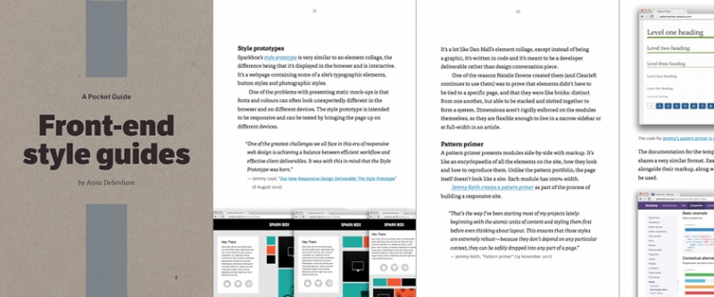
- Anna Debenham: Freelance Front-End Developer based in the UK
- Anna's book: Front-end Style Guides
- 5by5 | The Web Ahead #38: Game Console Browsers with Anna Debenham
- Anna's collection of Front end style guides and pattern libraries collected in Gimme Bar
- Design in the browser with web fonts and real content - Typecast
- Macaw: The Code-Savvy Web Design Tool
- Front-end Style Guides — 24 ways
- Style Tiles
- Pattern Lab | Build Atomic Design Systems
- Code for America
- Code For America | Clearleft · Our work
- Code for America Style Guide
- Starbuck's Style Guide
- Jeremy Keith's Pattern Primer on GitHub
- A Maintainable Style Guide — Ian Feather
- clearleft/crate
- Barebones - An initial directory setup, style guide and pattern primer
- paulrobertlloyd/barebones
- Style Guide | Drupal.org
- Anna Debenham (anna_debenham) on Twitter
- The Web Ahead (thewebahead) on Twitter
- Jen Simmons (jensimmons) on Twitter