Episode 100
Designing the Web with Jeffrey Zeldman
March 18, 2015
For episode 100 of The Web Ahead, we have Jeffrey Zeldman, the Godfather of Web Standards (or Web Design, depending on who you ask), to talk about the past, present and future of making things for the web. We debate the pros and cons of everything from parallax scrolling to data mining.
In This Episode
- How the web standards movement changed web design forever
- What are the current web design trends? What's next?
- What lessons have we learned as an industry, doing things in a way that turned out to be a bad idea? What anti-patterns should we be avoiding?
- How do we create great, even innovative design for the project on which we are working, and not chase empty trends?
- Form v. function
- How do we keep up?
- How does one create great web design?
- Are we thinking carefully about the kind of world we are creating with the work we design?
- What are the harder conversations that we should be having?
- What's the downside, and responsibility, of big data?
Carousels! Ha ha! Who uses carousels?" It's like – "Yeah, you did, six months ago.
Transcript
- Jen
-
This is The Web Ahead, a weekly conversation about changing technologies and the future of the web. I'm your host Jen Simmons and this is episode 100. I want to say thanks to our sponsors today, Squarespace and Code School. I also want to say thanks to Pantheon for powering the The Web Ahead website. And CacheFly for delivering all of the audio files that you are listening to. The fastest, most reliable CDN in the business.
Episode 100! Very exciting. Kind of a meaningless, yet monumental number. To do something special, I thought I would have someone on the show today who has not been on the show yet. It seems weird that I've been doing this for three and a half years without having this guest on. Here he is today: Jeffrey Zeldman. Hi, Jeffrey Zeldman.
- Jeffrey
- Hi. How are you?
- Jen
- I'm good. I'm really happy to have you on the show today.
- Jeffrey
- I love your show. I'm really, really thrilled to be on.
- Jen
- Thank you.
- Jeffrey
- I was on episode 100 of The Great Discontent. That seems to be the thing. [Jen laughs] Nobody thinks of me, then they go: "What are we going to do for 100? Oh my gosh. Let's pry Zeldman out. Is he dead yet? No? Let's see if we can get him."
- Jen
- I thought about [waiting and] launching my website for episode 100, but I really wanted to do it [sooner than that].
- Jeffrey
- I'm very inspired that you did [a site]. I'm working on one as well.
- Jen
- Nice. For The Big Web Show?
- Jeffrey
- Yeah.
- Jen
- People might not realize that you have a podcast.
- Jeffrey
- I do. It's called The Big Web Show on the 5by5 network. The same network you're on. What do you think? Should I go to 15 Best Parallax Website Templates? [Jen laughs] Put my whole archive in a single page, responsive, parallax template?
- Jen
- Yes. [Laughs] How many shows do you have now?
- Jeffrey
- Let me see. I don't have a website so I have to 5by5 and look for The Big Web Show.
- Jen
- I have a player. You could also put a player...
- Jeffrey
- You have a player? Oh man.
- Jen
- ... with 100 episodes listed. You could put the player 100 times on the page. [Laughs]
- Jeffrey
- That's what I was thinking. I have 128 episodes.
- Jen
- Right. So you have 128 audio players that are loading 128 audio files concurrently.
- Jeffrey
- Prefetching.
- Jen
- Yes, prefetching them.
- Jeffrey
- And then playing them simultaneously.
- Jen
- And then parallax them.
- Jeffrey
- Oh! Use JavaScript, so as you parallax up and down, the different conversations come into focus. But they all start at the same time. So if you're unhappy eight minutes into Designing with Data, you can just scroll up one. It's like if Digg had a child with Google Hangouts. Or two Jews talking about business. Or font lover's pizza. You can just scroll up.
- Jen
- And there's a cool new web technology you can use to lay out the page. I think it's called tables. [Laughs]
- Jeffrey
- Does tables work for parallax?
- Jen
- [Laughs] So for anyone that doesn't know who you are... do people call you the grandfather, the godfather, the father of...?
- Jeffrey
-
Eric Meyer calls me the grandfather. Everybody else calls me the godfather. Thank you, Eric. [Jen laughs] I kid because I care.
I've been called The King of Web Standards by Forbes. The Godfather of Web Standards by me, secretly, with hand puppets. And The Godfather of Web Design, which is even more ridiculous. I'll take it because...
- Jen
- Why not?
- Jeffrey
- Honestly, so many people contributed to web standards, it's just ridiculous. But I'll take it. I was the person who made other people notice who hadn't paid attention.
- Jen
- I feel like you were the big evangelist. There were a lot of techniques that evolved, and a lot of wisdom among people who knew what they were doing. Hundreds, hundreds, hundreds of people. Slowly, this group wisdom emerged. A lot of the techniques that were used in the 90s were not good. They were actually really bad. There began to be a new way of doing things. "Web standards" became the name. "Don't use these techniques or hacks. Use this. This is what the web actually is."
- Jeffrey
-
Let's back up. There was no other way to do web design except with invisible pixel divs, spacer GIFs, setter tags, and table layouts. Because browsers didn't support standards. There were no standards for the web, period.
There was a W3C after a little while, started by Tim Berners-Lee. They had these recommendations. They got the big browser company at the time, Netscape. Later, when Microsoft got into the business, they got Microsoft. And they got other companies sitting at the table. These eggheads would propose, "Hmm, it might be nice to have a visual layout language." As we all know, Håkon Lie and Bert Bos proposed CSS.
But the browser companies had no reason to implement those standards — they were competing on features. Netscape made up its own tags. In the very beginning of the web, that wasn't a bad thing. There weren't enough tags. Tim Berners-Lee conceived the web as document sharing, and was very agnostic about how things looked. That was cool, and that is still what the web is. But there began to be commercial applications for the web almost immediately, as soon as the Netscape browser came out. Netscape said, "We don't have a way to get pictures in here. So we're going to make an <img> tag." Tim Berners-Lee was like, "I'm working on something. I might call it <object>." He gave the egghead reasons why it might be <object> and they were like, "Great. By the way, our browser now supports <img>." They made up their own tags. Later, Microsoft kind of did the same thing.
Around 1998 — before a lot of listeners were born — some friends and I had been designing websites for three years. We saw that it was all broken. I had to do IE3, IE4, Netscape 3 and Netscape 4 versions of a site. At the time, the two browsers were coming into equity. Not equity in features, but they were both equally popular. Lots of stuff was going on that was shifting the balance away from Netscape toward Microsoft. Some of it was political, some of it was criminal.
Anyway, there were basically two phases of web standards. In the first phase, my friends and I got together and made the Web Standards Project. It seemed like the best name — we could make WaSP out of it. A wasp is a little creature but you don't want to get it mad. That's how we felt about individual developers: powerless compared to the big companies, but if you get enough designers and developers pissed off — if you step in a wasp's nest — it's going to suck.
We had a character called The Wasp that wrote these editorials. The Word from the WaSP. At first we were pretty aggressive. Originally, Glenn Davis was the chair of the group. For whatever reason, he had to step down. George Alston did it for awhile. Then he stepped down. I designed the site and helped write the copy. There were lots of other people involved. People who knew a lot more about technology and the web than I did, because I was self-taught and I was just making it up as I went along.
The first phase was getting the browser makers to support web standards. That was a struggle and it took some going. I think you've had Tantek on the show?
- Jen
- Yeah. [Episode 46: The Web Behind with Tantek Çelik]
- Jeffrey
-
Tantek created the IE5 for Mac browser, which was the most standards-compliant browser at the time. People said a lot of stuff about Opera. I don't want to get into that. In terms of supporting CSS, IE5 was way ahead of its time. He came up with a new standards-compliant rendering engine.
There was the first phase, and then the other browser makers were shamed into it. The first thing was really for us, our group, calling the stuff "standards," and insisting that other people call them that, even though the W3C didn't call them that. When you name something, it gives you power over it. It's the Peacekeeper Missile. You know what I mean?
- Jen
- Yeah. It also reflects what happened to the train industry. Everyone had different sizes train tracks, and then they were like, "We should have a standard for this. Then there's an actual industry body that makes rules.
- Jeffrey
-
Yeah. And let's not have the web go the way of VHS and Betamax. Three, five years into the web, let's not have it get fragmented. Let's have the web content be accessible to all. Let's keep doing design and behavior and advancing, but let's do it in a way that all browsers support.
The first phase, from 1998 to 2000-2001, was really that. Around 2000-2001, the browsers were good enough at CSS. In 1998, we were using CSS for type size, to prove that it could be done. But still doing it in the context of a table layout. There was no choice if you wanted margins and gutters. Once the compliance set in, the strange thing was, nobody was using it. There was the same tiny, avant-garde group of design and development nerds. Because they believed in accessibility or because they were coders by nature — whatever it was — they were writing semantic markup and using CSS. But 99% of the industry was not doing that.
The next phase was to get designers on board. That was really hard. I think the two things that did that were my 2003 book, Designing with Web Standards, and CSS Zen Garden by David Shea in 2004.
In my book, I was talking about making type bigger for people who needed it. They could push a button. There was lots of abstraction of layout. But I didn't figure out the persuasive piece of making the design really cool. I was trying to do good design, but I didn't figure out what Dave figured out: give people the same content, and have them design any way. Not necessarily a usable web layout. Maybe creatures under the ground reading the copy, or a strange and tranquil garden. People were very crazy. Designers who thought Flash was the only way to design suddenly went, "Oh, now I get it. This stuff is cool."
- Jen
- It seems like to this day, people struggle with the idea that content is in the HTML and CSS is doing the styling. Those are two very separate layers and they don't mix together. As long as you have great HTML, you can use CSS to do a wide range of things without [messing up the] HTML [to hack the visual display].
- Jeffrey
-
There's a whole new generation that has grown up with CSS for layout. That's just how you do things. Unless they had to design HTML emails, they haven't done table layouts at all. But the idea that HTML needs to be semantic and accessible — that your site should work even if JavaScript fails or a script doesn't load from a remote server — they still don't get that.
Even today, there's this really super-talented group of new people coming through code schools and these wonderful new organizations that are training people. They can do amazing stuff with HTML technologies. But they don't necessarily know about progressive enhancement. Those things near and dear to you and me.
- Jen
-
Your book, Designing with Web Standards, is so well-written. You're an amazing writer. That was my beginning. I had struggled. I had built some websites and really struggled with how to make it work in multiple browsers. I didn't have a community of people to work with or talk to. I was isolated, me and maybe one friend [who was into technology]. I thought it was me. I'd work on this stuff, write this code, and it didn't work the way the book said it would work. I struggled, struggled, and struggled. I thought, "I'm just not smart enough," or, "I can't figure this out."
I was sick of it. It was annoying beyond belief. I thought, "Eh, maybe I won't do this anymore." Then I read your book, and I was like, "Oh! It's not me!" [Laughs] This way we've been doing this — with browsers that aren't compatible, and making the HTML do the design with tables — is a really bad idea. It is very laborious and dumb. I should use the technique from this guy. I don't know who this guy is, with his blue hat on the cover. But whatever he's saying, I like this. I should do this.
- Jeffrey
- Did the cover scare you?
- Jen
- No, actually, I think it made me wonder who you were, and read your name. With most tech books, I'd never read the person's name.
- Jeffrey
- Was that the orange book? The first edition?
- Jen
-
Yes.
I describe my experience because I think it was an incredibly common experience. I think this is what happened for a lot of people. A lot of things clicked. A new technique was presented that seemed very doable, and much better than what we had been doing before. It was presented in a way that was easy to understand and made a lot of sense. It made me excited about the web all over again.
- Jeffrey
- Thank you. You said a whole lot of complimentary things. Thank you very much for those things, which I don't really deserve. I am glad that it got people re-thinking how they designed. I think we see a similar thing happening now with responsive.
- Jen
- Yeah. It felt like that [switch to honoring webstandards, and using CSS for layout instead of tables] was a big pivot in the industry, and it took years. Many people embraced the idea very quickly, but many people, 10 years later, were still insisting that tables was a great way to lay out a website.
- Jeffrey
- I'll still see stuff like that.
- Jen
- I could name big websites right now. [Laughs] I won't. Well-respected companies in the tech industry are laid out in tables using technology from the late 90s.
- Jeffrey
- When Andy Clarke's son was in middle school... do you know this story? Andy Clarke is a great web designer in Wales. His son was in middle school and failed web design class. Because the teacher had a five year old book and was trying to get the son to make HTML table layouts. The son would come home and talk to his dad. The son had done this great CSS layout, and the teacher failed him for not following directions. "You rebellious fool!" The son was arguing for semantic markup and CSS. This only happened three or four years ago.
- Jen
- I can believe it. That's what happens, especially in schools.
- Jeffrey
- Schools are always behind because they can't afford to always buy new books. They're using old books. Schools are in bed with certain big publishing companies that have an inventory to maintain. Nobody has time to do independent research and discover an alternative approach or publisher. I love teachers; they work really hard, It's just an overwhelming job.
- Jen
-
Let me jump in with our first sponsor today, Code School.
You can put those programming books — those old, antiquated tomes of paper — you can put them away and learn by doing with Code School. Code School offers a variety of JavaScript, HTML, CSS, Ruby, iOS, and Git courses to help you expand your skills and learn new technologies. You can advance your programming knowledge. Some of these courses get deep and detailed, so they've got basic, how-to, beginner level stuff, and they've got advanced, get-down-into-it-pretty-deep, more advanced kinds of stuff. As you may know from previous sponsorships, they're a place to learn where you can try things out. You watch a video, the teacher explains how the technology works, and you're given an exercise. You're right there, on the website, in a window, editing the code. Maybe they give you a little bit of code to get started. Maybe they have a blank page. You fill in the code, you're following along with this exercise. You can see the code and what it's doing and see it running. You can tell whether or not you've got a mistake. You can fix your mistakes. You can go off the beaten trail and start improvising and messing around and saying, "That's what the exercise wants me to do, but what if I do this other thing? What happens?" Really mess around, the way you would with a real code editor, but without all the hassle of setting that stuff up. Sometimes it's just way too much. It makes you not want to jump in there and learn something. Because you've got to go set up the thing, and open the thing, and pull this over. Here, you just jump in, and everything is in one place, ready to go. You can focus on learning rather than being stuck.
You can try it before you buy. Roughly one out of every five courses on Code School is free, including introductory courses for Git, Ruby, and jQuery. You can check them out at codeschool.com and see whether or not you like it. Try a course. See if it fits your learning style. You just log in — with no credit card — and you'll start taking this intro course and earning points and badges and all of that gamification good stuff. If you decide to jump in with a membership, you can just keep going.
I was digging around today and they've got a bunch of other videos that are not courses. They've got Code TV, and a Soup to Bits series that's a bit more practical. Feature Focus, where they look at real production websites and what big, famous companies are doing with their code. They have three videos on web components. One is called Building a Web Component. They've got one on the HTML5 manifest file, showing you how to set that up with application cache. They've got a video on HTML5 multimedia. They've got a video on how to use
contenteditableand web storage. Things we talk about on the show, but I don't teach you how to use it. I just tell you why you might want to. This can be the next step. Have someone show you on a video how to set upcontenteditable. One that is free is Agile Best Practices. It's a little less than 15 minutes long. They talk through Agile, how it works, how to set up a sprint, how does it go wrong, how you prevent it from going wrong. Valuable stuff for anybody trying to run a team.Go check them out: codeschool.com. Thanks.
- Jen
- What do you think about the state of web design today? Where do you think we are in the large arc of things?
- Jeffrey
-
Do you want to know the 30 best websites with parallax scrolling? Or the 20 or 50 best parallax scrolling websites?
I think we're in an amazing place. A few things have happened. I think Luke Wroblewski putting together the phrase mobile-first. People have made variations on it, like content-first. Basically, it's designing around the content. Presenting the content, getting out of the user's way. That's huge. I think five years ago, web designers mostly would get a brief and go into Photoshop and make something pretty. Even really smart web designers; I did that. Not that I'm saying I'm really smart. Wow. [Jen laughs] I'm drinking less coffee, so I'm going to be less articulate and probably more honest.
I think user experience has come to the fore. Research has come to the fore. Not every person in this business, but a lot of people in this industry, when they get an assignment, they say, "Great, I'd like to meet some users. I'd like to spend time learning around the client's product." You don't just jump into Photoshop. You do research. Even if the client says, "Nobody uses mobile," most people in our business say, "It's really up to the user how they're going to access the content." If the client says, "I've got a mobile site." I will shame somebody. It's NY1. Do you know who they are?
- Jen
- Yeah, the local TV station.
- Jeffrey
- There's a local TV station. Only if you're a Time Warner Cable subscriber.
- Jen
- In New York City. It's very local.
- Jeffrey
-
They do Bronx and Brooklyn. NY1 covers all five boroughs, but I don't know if Time Warner Cable has access to all the boroughs. That's a whole crazy... the cable industry is like a country run by warlords. [Jen laughs]
I was in a car for four hours yesterday on a 45 minute drive because of treacherous ice and snow. Nobody was clearing the highways and it was terrible. My daughter got home really late and she was like, "I haven't seen you, dad. I hope there's no school tomorrow after all this." I said, "I hope so, too."
We got up in the morning and the streets were clear. They didn't clear them during the treacherous snow, they cleared them after. I looked on the New York Times and it said nothing about school closing. I subscribe to a mobile notification that lets me know if there's an amber alert, if an old person goes missing. It tells me all kinds of emergency information, but mainly I get it so I'll know if the school closes. None of that had been activated. I was pretty sure school was open, and in fact, it was. I thought, "NY1 will be good for this." I went on my phone to look at NY1's website. [Laughs] They had updated it, in that everything was in Helvetica now. They updated the fonts and put some white space in it. But it still wasn't responsive. In fact, it doesn't even fill the full screen of a small iPhone. They leave extra room. My friend Tim Murtaugh, who I work with, said he thinks they probably put in a breakpoint. It's squishy but it's not responsive. He thinks they probably put in a breakpoint so it looks good on the boss' iPad. I think that's probably correct. But if you look at it on your phone and can't read it, it pushes an ad for you to get the app.
So they know you've just come to read their content. They know you're on mobile. They know they've created a website you can't use on mobile even though it would be the simplest thing in the world to put in some responsive breakpoints and rejigger the layout. Instead, they want you to download their crappy, two star rated app. I love apps, but I'm not going to do that. If something is a public news vehicle on the web, why would I?
There's a lot of that nonsense still, everywhere. There are a lot of people who know better and want to do a good job but their boss won't let them. I do think there's a lot of people doing research, people reading about UX, a lot of pattern libraries. Which I don't think of as something that you slavishly copy. I think of it as something you learn from. You can go, "Hmm." Again, thinking about Luke Wroblewski. The hamburger menu on its own isn't as helpful as the hamburger menu with the word "menu" next to it. You learn from things like that. I think there's a lot of exploring. I think responsive has been huge. Thinking about adaptive content — all of that stuff is great. Clean, big type layouts. A few years ago I said, it seems like we're designing responsive books now. At first with responsive, we weren't thinking about type.
People are focusing on bandwidth and giving themselves bandwidth budgets. If we want to use the italic version of that web font, what can we cut? Can we cut this image? Thinking about bandwidth again, thinking about users on networks that we just don't know. There's no reliable way to know their screen size and things like that. All of that stuff is great. There's tremendous professionalism. But I also think it's gotten hard as hell. And complicated as hell. If I were a web designer starting now, I don't know that I'd even get into it. The way I learned in 1995, I got a book on HTML. I think it was Jen...
- Jen
- Jen Robbins?
- Jeffrey
- Yeah, I got Jen Robbins' book. I was like, "Oh, ok." It was so easy. I had used WordStar.
- Jen
- Yeah, I used WordStar. It was a word processor, before Microsoft Word, before WordPerfect.
- Jeffrey
-
It was a DOS word processor. You typed commands. I would be like, "Italic. I type the i command." I learned it in about five minutes, because it was just mapping one really dumb, anti-user skill pattern into another. [Jen laughs] It was like, "HTML? It will work just like WordStar." That was great. That's all I had to know. I learned table layouts from Lynda Weinman and David Siegel. I made up some stuff and it was great. It was easy.
The hardest thing was around the turn of the millennium, transitioning from table layouts to CSS. CSS still feels a little intuitive to me, in a way that I think it doesn't to people who started designing websites after 2000. Once browsers supported CSS, and CSS Zen Garden and my book were out there and people got it, I think it was relatively easy.
But now it's so complicated and there's so much we can do. Sometimes I feel like web designers fall into this pit of, "I'm going to design something because I can. I'm going to lazy load everything and pop up all of the photos in their own popups." Sometimes it's like, wouldn't it be ok to just provide a URL? Wouldn't it be ok if I clicked this link and it leads to another linked webpage? Does it really have to open in its own box, kind of blocking the background of the thing I was just reading? Me having no way to be sure that I bookmarked it?
During the days of Flash, I remember people hijacking the scrollbar to make it look more branded. Redoing it in Flash. Hijacking the type and not using the user's fonts, but using a weird little pixel font. There were lots of problems with that approach.
- Jen
- Scrollbars in Flash were just terrible. They were slow and hard to use.
- Jeffrey
- One pixel per second or something. And when you hit all the way down, instead of it going all the way down, it would go 10 pixels, maybe.
- Jen
- [Laughs] Right. But you could make it orange, the same color as your logo.
- Jeffrey
-
You could make it orange. If you were using IE, IE had given into a client that said, "Our website's brown and we want a brown scrollbar." So you could do it in a browser.
I do feel it's tempting right now to do light boxes and parallax and carousels. Nothing is wrong with any of these things, in and of themselves. We can get really dogmatic. The people who do things well, who care about best practices, can snicker and go, "Carousels! Ha ha! Who uses carousels?" It's like, "Yeah, you did, six months ago. Now you scoff. You were really proud of that. That was a beautiful carousel, man." We're experimenting, which is great. There's a tension right now between making a newspaper — it's responsive, the type is big and there are very few distractions — and the kind of crap we still see on the link bait sites.
You're reading something on Huffington Post. Maybe it's a political article. Below it says, "You won't believe what this celebrity did with plastic surgery," and I'm like, "I'll hate myself in the morning but I've got to see it." I click, and the only thing I can compare it to is porn. You're deliberately trapped in these anti-patterns. They've got these windows open that are hard to shut. You have to click 17 times to get to the page you really want. The whole time you're trying to click to that page, they're distracting you with other pages.
- Jen
-
Right, the ad overlays on top of the timer, on top of the carousel.
When you're a designer and you have a new project or a new feature, and you're on a deadline — which is always — and a limited budget — which is most of the time — it seems easy to say, "What am I going to do for this? Let me open up 10 of my favorite websites, see how they solved this problem. I'll just copy them. I'll borrow something from four of them and mash it together so it's not a complete steal." It's like, "Look at this carousel and this parallax website and this hero graphic and this single column down the middle. This is what responsive means to me." Put so much focus on the form and making assumptions about what the form should be and copying the coolest, latest, newest thing. It feels like a normal stage to go through, as a designer, when you're not sure what else to do. But that's not how great design gets made.
- Jeffrey
- It's not even that. I think those are ambitious people. I think those are ambitious designers doing what we all did at the beginning, looking around, going, "Well, what did Doug Bowman do? Let's see. That's pretty cool. Let me see if I can copy that. What did Dan Cederholm do? Let me copy that." I think it's beyond that. I think folks go right to Bootstrap or 50 other frameworks. Those frameworks are great for backend people who want to make an app and test it quickly. But a lot of assumptions come with frameworks. If you don't involve a designer from the very beginning. I don't mean a graphic designer, I mean a user experience and graphic designer. I think you should do all of that, if you're going to be a web designer. There's a lot of Bootstrap-y stuff out there right now, and five other things like it. There's a lot of sameness. A lot of sameness in app-type sites. Then there's a lot of parallax websites that are portfolio sites for designers, or single page sites to make an actress or rock band look cool. Do people say rock band anymore? [Jen laughs] I don't think that exists anymore. That's really archaic. Rock band. Wow. I just said that. It's like I said butter churn.
- Jen
-
Let me jump in with another sponsor, Squarespace.
Squarespace is the easiest way to create a beautiful website, blog, or online store. You can end up with something that's super professional and responsive and all of the good things that you want everything to be. Worried about SEO or semantics or accessibility. All of these very complicated things that we spend increasing amounts of our time making sure that everything is working properly. But sometimes, you want to build a website and you just don't have time to do that. Or maybe you don't have the skills. Maybe you work with a team that has those skills but you haven't figured out a lot of that stuff yet. It's fine. You can go to Squarespace and focus on the content of your website. What is it going to say? What is it going to look like? What kind of experience are you creating for people? Maybe it's a site you're building, or maybe it's a site you're helping somebody else build. Sometimes it's just, honestly, not worth all of the time and effort to build something from scratch or build something on top of a CMS. Squarespace is a great solution.
People come up to me all the time and they're like, "Uh, you know how to build websites, right?" I'm like, "Ok, here it comes. They're going to ask me help them build their website." I used to cringe. I used to feel like, "Ah, I don't want to volunteer for 100 hours of unpaid work to help this person with their website." But now I welcome the question. They're like, "I don't know what to do..." and I'm like, "I know what you should do. You should go to Squarespace." I really do tell people that, all the time. That was my answer long before Squarespace was a sponsor.
squarespace.com/webahead will tell them that you are checking them out because of this show and it helps support the show. You can use the coupon code JENSENTME and you'll get 10% off your first purchase. You want to pay for a month, it's 10% off the month. If you want to sign up for the whole year, it's 10% off the whole year, plus you get a free domain name if you sign up for a year. They have 24/7 support, via live chat and email. They're used to having customers who really don't know what they're doing, building a website. They've got all kinds of tutorials and videos and help. If you do set up your friend or low-budget client with a Squarespace website, they not only get the awesome tools, they also get a pile of videos they can use that will show them how to add content to their Squarespace website. How to customize their Squarespace website. You don't have to do all of that basic training. You can rely on Squarespace and the Squarespace chat. Someone gets stuck because they added a photo and they're confused and they don't know what to do. You don't want them emailing you. You want them emailing Squarespace — 24 hours a day, 7 days a week — to help. You're trying to upload a file and it's not a JPG, it's an EPS. Eight bucks a month. I guess the dude is on Valium. I don't know how they make it this cheap to get this level of quality and support. I'm a big fan. Thank you so much to Squarespace for supporting The Web Ahead.
- Jen
- What makes great web design? What's the secret?
- Jeffrey
-
That's a huge, huge, question. I think great content. I think a look and feel that reflects that content. It makes people feel personal to it.
I'm a diehard Flickr user. I'm in an alpha group, so I'm looking at Flickr's new design that hasn't come out yet. It's amazing. It just makes me pictures feel elevated. There was the old Flickr, where my pictures were small, but I understood how all the features worked. There had been several versions. Recently, they started making pictures much bigger. There was a hybrid design that was a cross between something like Tumblr and something like Flickr had been. I think where they're going with the new design... I feel bad talking about it, because not everybody can see it.
I think Twitter. Most people use Twitter on the web. You and I and most people we know use apps. We use Twitter's app. But their base goes to their website every day. I think changes that have been made to their website have been really good. They make it feel more personal. My profile feels personal and has a few really delightful features, like the way the header reshapes itself for different sizes and a slight bouncy parallax effect on the avatar when you scroll up and down. Little bits of CSS animation and motion. Basically, this is an app. This is a multi-column app. It's the ugliest, stupidest newspaper in the world. It's a newspaper written by idiots with 140 character articles. That's Twitter, in a way. [Jen laughs] Right? It's a curated newspaper written by idiots. But. For me, the new design gives me a sense that it's my website. I don't mean the way MySpace did. They don't let you customize it into a horror. They do let you customize it enough that it feels personal. Yet, it feels better than what you would have done, because most people using it are not designers.
Design is always constraint, it's always purpose. If design doesn't serve a purpose, it's art. I love art but it's not the same as design. Design has to reflect the content and make it easy to create that content. If it's a social site where people create their own content, make it easy to digest that content. If it's the New York Times or A List Apart or a content site, make an accommodation for ads or whatever pays for it. Without having that take over and destroy the experience.
I've seen travel sites that interrupt you trying to get a ticket with ads for a different destination. Because they make money that way. I'm like, "Are you trying to expedite what I need to do so I'll come back and use your site again? Or are you trying to make a quick buck on me? A quick eight cents because you made me look at a Jamaica ad while I'm booking a flight to Boston?" (Now I feel bad about going to Boston when I could be going to Jamaica. No offense, Bostonians. But it's winter.)
- Jen
- Newspaper sites do the same thing. You get two paragraphs in, and there's a headline to get you to leave and go to a different article.
- Jeffrey
-
Yeah. They're constantly interrupting the experience. They try so hard so get you to come to their site. They don't want their content flying out. They don't want you to read their content wherever you happen to choose to read it — in your RSS reader or repurposed on someone else's site. They really want you to read it on their site, where their ads are running. Yet, they interrupt it with ads for other content or going to someone else's site, because they're making money that way. Everyone's scrambling to figure out the money.
I think we know what makes great design — it's readable. Not just legible, but it invites reading. If it's a site about written content; a newspaper, magazine, website. If it's got art direction, an illustration, or something going on. I don't mean if you've written a listicle — 12 Great Ways To Do X In Social Media. Then you get a stock photo of a cookie or a flower or someone eating a salad, and feel like your job is done. I mean, there's something. With A List Apart, we work with illustrators. There's some consideration to how the thing feels and how the feeling of the site — the way type is on the page, the way articles link to each other — that affects how I feel about what I'm reading.
When I was writing Designing with Web Standards, I had to write it in the font I wanted to use when the book was printed. Which was… it was a Zuzana Licko and Rudy VanderLans font, which means it's an Emigre font… but it's not Mrs Eaves… It's one of the less well-known [remembering] — Filosofia! I actually had to write my whole book in Filosofia. I had to come as close as possible to writing in the layout that the reader would see. I can't use a CMS that doesn't have a live preview. If I don't know how that page is going to lay out, I can't just write. I can't take a client's content and lay it out. I have to know.
In a way, like with print, the perfect marriage — whether subtle or not subtle — is of type and content, and of layout and content. My cousin gave me this amazing architecture book from a university press. I love architecture. This is a history of New York buildings. That's totally stuff I love, and I've never read it. I can't read it. Because the type is laid out so poorly. I'm not being fancy. I'm not like, "You see, I'm a designer, and I care about these things." I don't mean that. I mean, literally, my eyes keep getting lost. I start to scan the page and I lose track of where I am. Because it's laid out that poorly. How can something about architecture be so poorly constructed and designed?
- Jen
- Your mentioning architecture reminds me… there's something about a lot of modern, recent architecture that can drive me crazy. Especially famous architects, or architects who want to become famous. Architects who have been focused on the culture of architectural school and awards: "Look at us, we're architects." That did not used to exist. If you think about what architecture was 300 years ago, it was not about making a name for yourself because you're designing a building that will be famous as A Building That You Designed. That just didn't exist.
- Jeffrey
- The Chrysler Building might have been the first, in 1929. The first time an architect said, "Look at me! Look at this! Am I blowing your mind?"
- Jen
-
[Laughs] One of the things I see with new buildings, is that the architect is working so hard to be fancy, or to put emphasis on their work — "Look at me, look at my design, look at the innovation that I created, look at the form. Look at the form of architecture. Look at the way I've evolved architecture." The building itself is not very functional. Or the building doesn't hold up. This started happening in the 50s — those buildings didn't hold up to weather. Because the materials that were used were not practical. The metal rusted. The fancy roof that was flat and had a big, pointy corner that supposed to be so awesome, leaks like crazy because the water doesn't run off like a traditional roof. The roof is not actually doing the job of a roof.
There's something so pretentious in that. It's always bothered me and drives me crazy. Perhaps there's something similar on the web. There's a way in which we get so caught up in a fancy new something-or-other, or the form of it. We get away from focusing on what you're talking about being the most important thing. What is the content of this website? What is the purpose of this website? What are users coming to this website to do? How can we deliver that experience to them? Do it in a way that looks amazing and beautiful, sure. But the aesthetics of the layout and functionality should serve that master of delivering the article, the interface for buying the airline ticket, or whatever.
- Jeffrey
-
You're talking about designing a website like Mies van der Rohe or Louis Sullivan would have designed a website: around function. Rather than like Renzo Piano. Like the designer had this amazing concept that seems impossible to build and built it anyway. Whether it works well for its use remains to be seen. I actually think Renzo Piano is great at that, but I'm not sure I want to live in a building Frank Gehry designed. They look amazing. His City of Wine Complex in northern Spain, which looks like a giant, crumpled up tin building. Except the curves are beautiful, it's not as random as that.
Mies van der Rohe said, "Form follows function." I think that's true for the web. You can certainly make something that calls attention to itself and is gorgeous. That's not necessarily a misstep. It depends what the site is for. I think if Facebook called attention to itself, nobody would be using it. It has to be super functional.
- Jen
-
I do think there's a tremendous amount of room for innovation. That's what this whole show is about. I feel like I'm constantly pushing everybody to innovate and re-think what you're doing and take more time to do something amazing. Rather than defaulting to the way that it's always been done.
Let's ask the question of, "What is the function? How can we not default to a 2003 blog layout for the 150th time, because we aren't thinking about it?" But come up with a layout that serves the content better than a blog layout could possible serve that content.
- Jeffrey
-
It really depends what you're doing. We have to redesign Happy Cog soon. I would love that to be gorgeous — drop dead gorgeous. Don't even look at Happy Cog right now. We're getting clients and it's doing its job. There's nothing wrong with it, but everyone at Happy Cog wants to make something wonderful and subtly amazing. Not "look at me, look at me, look at me." Something that will appeal to clients but other practitioners will go, "Oh, that's clever, what they did."
Ten years ago, we had a version of the site that used a sentence as navigation on the homepage. Apparently other people had done that, too. We weren't copying them, we just came up with it independently. It was a nice idea. There was an idea and a point of view.
It's harder to stake out territory like that now. There's so much work out there now. If you were a filmmaker and Charlie Chaplin's time — not to take anything away, Chaplin's a total genius — but when Chaplin invented a form of storytelling, or the guy made that horrible Birth of a Nation... what was his name? He invented intercutting and based it on Dickens. Charles Dickens was the first novelist to tell simultaneously, "What's happening to little Nell?" and back, "What's Fagin doing?" I'm mixing two stories, but you get the idea.
- Jen
- You could make these big innovations because there wasn't much out there yet.
- Jeffrey
- There wasn't anything out there. Now, to be an innovative filmmaker, I don't know what you do at this point.
- Jen
- But there are innovations. That's what is so fascinating.
- Jeffrey
- There are.
- Jen
-
They're huge. You look at something like House of Cards... dropping 13 episodes, streaming — the filmmakers count on the fact that viewers are watching them in order, and have seen every single minute. They expect the viewer to be smarter and paying even more attention. They can drop even more subtle hints, and say even less.
D. W. Griffith is the name.
- Jeffrey
- Yes! Well done.
- Jen
- Thanks Google search. [Laughs] Thank you, the web!
- Jeffrey
-
What you just alluded to as an innovation — and I totally agree that it is — it wasn't a filmmaking innovation. It's not like they put the camera down the actor's throat and filmed from the outside. It was a business innovation.
First, when HBO said, "The Sopranos is so good, we're going to put it out on DVD." Suddenly, even though you'd only seen three episodes on TV, you would mainline that show. I went for years without getting HBO. I just waited for the DVDs to come out for the Sopranos. Then just mainlined that shit. Totally addictive.
I think Netflix understood that, because they were originally a DVD loaning service. When they became a streaming service, they were like, "People are really watching these old TV shows and all of this content we didn't create."
The other huge innovation they did was, they made compelling drama but they used data to design that drama. They knew that Kevin Spacey was popular with their subscribers. They knew people liked him as a villain. They knew how much on-screen sex activity their viewers wanted in a Kevin Spacey vehicle. Not too much, not very much, not explicit. But a little. And it should feel dark and menacing. They knew that from the Kevin Spacey movies that were popular and they knew where people would stop watching. They knew where people would quit watching in the middle. They bought a story that someone else created — House of Cards was a British show — but they changed it radically to be a perfect Kevin Spacey vehicle, with all of the things that they knew about what their users like. Like a Scorsese or the Sopranos but driven by data about what the users want. Which is very different. There is their innovation. Not only do they dump at 13 episodes at once, knowing people will mainline it. It even effects their Twitter feed. When Frank says something on Twitter, he has to address every episode, because they don't know where people are in the watching experience. He has to do it in a way that doesn't spoil an episode I haven't seen yet. It's really pretty intriguing.
I think all of those things are business innovations, as much as creative innovations. Don't you?
- Jen
- Or storytelling innovations. You're right, not innovations with the camera work or editing… [but they are innovations in storytelling.]
I was like, "Wait, what? Data, what?" I just pulled up a New York Times article about this.
- Jeffrey
- You didn't know that?
- Jen
- No.
- Jeffrey
- Their House of Cards — again, they based it on someone else's TV series — they completed refashioned it to hit all of the dopamine points. It's like someone making the ultimate crack. It's like Heisenberg making the perfect drug, because he's a really great chemist. They know what people want, they know how much they can shock. It's kind of amazing.
- Jen
- I didn't realize they're scraping their own data and shaping the script based on that data. This is a David Carr article.
- Jeffrey
-
This is a huge innovation. It's more like web design, to get back to our topic.
In web design, we take our best shot at what we think it going to work for the user. Then we scrape our data and go, "Hm, for some reason, no one is hitting that button. We really want them to." Or we pivot and say, "Nobody cares about that button." The same way Twitter evolved as a side project. Maybe a websites starts out as a serious business magazine but people are only clicking on the feminist articles, then we pivot and it becomes a feminist magazine. Just to pull something out of the sky.
They're now doing storytelling — fiction writing, which is supposed to be escapist, but is also supposed to be inspirational and help us connect with our biggest fears and secret desires. Hitchcock would have loved it. Because he wanted to play the audience like an instrument. He wanted to terrify people and make them laugh and make them scream. He fantasized about it. It was like he wanted to have sex with everyone in the audience. Sex of a certain kind. Not mutual. He wanted to be in charge. I think these storytellers are now doing that. They're doing what web designers do, when we're lucky. Go back three months after we made the site and look at how people are actually using it and change the design.
Some architects are now doing it. Where they go back and look at the building and change it. Obviously they can't knock 10 floors off, but they can...
- Jen
- Re-do the sidewalks out front.
- Jeffrey
- Yeah. Thank you for saving me from that.
- Jen
- My father always used to talk about that. You're designing a college campus, don't put any sidewalks in. Leave it for six months. Then pave over all the paths that people have been walking on.
- Jeffrey
- Pave the cow paths, as Steve Krug puts it. Your dad is an architect?
- Jen
- Yeah
- Jeffrey
- That is fascinating.
- Jen
- Yeah, me and Mark Boulton both. It's fun when we get together to talk about how architect fathers.
- Jeffrey
- What was that like, growing up?
- Jen
- It was pretty cool. I learned to draft plans. My brother and I used to hang out and come up with our fantasy dream houses for when we were older. We would draft plans, to scale. When I was in elementary school. We'd hang out and draft blueprints.
- Jeffrey
- Elementary school?
- Jen
- Yeah, and middle school probably, too. We'd get in trouble, sometimes, for using his drafting table and using too much of his paper. But it was quite fun. And it came in handy later when I was designing sets. I already knew how to draft everything.
- Jeffrey
- That's right, because you were in theater for, like, ten years, designing sets before you got into web design. Actually, you got into web design that way.
- Jen
- Yeah.
- Jeffrey
- "We need a website for our theatrical production. Jen, can you do it?"
- Jen
- [Laughs] Yeah.
- Jeffrey
- My dad is an engineer. I wonder if I got interested in the web so early... although I rejected that. I was always trying to draw and tell stories and play music. I was the "creative type." But I must have that engineering gene, too. The web appealed to both.
- Jen
- Yeah. I know for sure those industries — engineering and architecture, which are incredibly close — and others, were using computers very early. Most businesses were not. Most businesses were still using a typewriter and file folders to write their letters. There were no word processors. There were just typewriters. It were those engineering businesses that needed to do a lot of math, computations, and spreadsheets. Those were the ones that converted to computers in the 70s and 80s and spent the money.
- Jeffrey
- They landed on the moon without the computing power that's in the iPhone. They landed on the moon with less computing power than what is in today's iPhone. No neuralnet. No connections. They could solve individual problems in a computer, but...
- Jen
- They weren't connected to each other.
- Jeffrey
- No. And there was no intelligence connecting them and drawing inferences. My dad worked on robotics. I was very disappointed, as a child, when I actually saw the robots. [Jen laughs] I was really expecting sci-fi, Robbie the Robot, Lost in Space robot. I was very disappointed. They just looked like industrial hoses. Pick and place robots that would do one small thing. If something dropped, the hand would look around and find what it was supposed to do. It had intelligence. That's amazing. He worked on rockets, too. Which is just amazing stuff.
- Jen
-
Wow.
So where do you think web design is doing?
- Jeffrey
-
I think good web design is figuring out ways to get the right content to the right people when they want it most. To make it readable. I think web content is not just surface design anymore. It's not just design of websites looked at in a browser on a desktop, obviously. But it's not just small screens. I don't want to sound like a convergence idiot, but, "How does this effect my toaster? How does this effect my FitBit?" Not just the part of the experience where the user sits at their desk and logs into fitbit.com. Not just the part of the experience where the user uses the FitBit app. What's the experience of using FitBit? How is that going to work? How do I recharge it? It seems like there's a chance for a lot of stuff to get connected up. Wearables. I don't mean to be stupid about it, or go too far in a sci-fi direction.
Five years ago, we started figuring out that the endpoint was not just a 1024x768 screen on someone's desk, on the fastest computer, with a direct connection to the internet that they could afford. We're learning that it's not just a mobile device, or a smartphone in an American's pocket on a fast network. We're designing for high-end and low-end. We're figuring out how to make our content usable to someone who might be accessing it in rural India. Where the electricity is only a few hours a day and fuel-based. They burn gasoline to create electricity, to create radio towers. We're also designing stuff that someone with a super fancy phone and two wearable devices on their body, is going to interact with.
It's a very, very exciting time to be a designer. I think since the web. Some people would say since the computer revolutionized type setting. That's definitely true — that made it really exciting. But that was still designing the same stuff, only faster. If you were designing a print ad or a book, you didn't just draw stuff and hope the typesetter did what you said. You could control the means of production. That was huge and exciting. But I think it's much more exciting now. We have this global network that's not only wired all over the world, but wireless all over the world. Different nodes are aware of each other.
Last night, my daughter and I were coming home from Connecticut in the back of an Uber [cab]. The Uber app was constantly recalculating. It was a terrible snowstorm and the car was sliding around. It was a really scary ride. The Uber app, somehow, in the midst of that insanity, was constantly calculating how many minutes until we'd be home. Based on how fast we were going at that moment, weather conditions, weather reports, what it knew about the driver. It was crazy. When I was calling my daughter on the way there, she said, "Dad, you said you'd be here in 14 minutes and now you're saying 16 minutes. Shouldn't it be 12?" I'd say, "Because it's constantly adjusting its estimate." And I showed her how when we got together. That's amazing.
There's a tremendous computational power. Our minds are just beginning to comprehend how to put it together. As web designer, it's very exciting. We're not just tangental to that, but we're an important component of that. We're not just sharing documents anymore. We're really connecting deep into people's lives. Assuming they opt in and it's positive — I don't mean in some weird, creepy, NSA way — although, there's probably some really talented web developers at NSA right now, figuring out all kinds of stuff, too.
- Jen
-
I would like to see us all not necessary just jump on a bandwagon of, "This is awesome! It's cool! It's new! It's robots! The science fiction of my childhood come true!"
I'd like to see us have a bit more of a critical eye and say, "This could end up being tremendous and amazing. This could end up being really bad." The technology itself is agnostic. It's up to us to make decisions about how we will and won't use it. It's up to each one of us to make decisions about what job are you going to take or not take. What clients do you want, what do you not want to do.
When you have a project, how do you want to help shape it? So that it ends up being a great company where you can get a ride, and not a pile of jerks like Uber doing things that are really awful — both to the drivers and for the people using the service.
I think we have a lot of agency to help make those decisions. Sadly, I don't feel like we're doing a great job yet, [as an industry], having a more critical [thoughtful] conversation.
IWhat the NSA has done is truly frightening. I want there to be great art, great TV shows — because they're great writers. This idea that Netflix is scraping the data and shaping the drama to fit the data...
- Jeffrey
- Still great writers…
- Jen
- It's still great work, but I have to go think about this. In episode 98 with Mark Boulton, we talked about this, too, when we were talking about advertising. I think there's a side to this that's not so great. I see a lot of web designers saying, "Design for data! It's awesome!" I'm like, "eh… let's talk about this."
- Jeffrey
-
I was at career day at my kid's school last Friday. I was talking about whatever it is that I do. One of the other parents was an advertising person, a media person, but she started explaining to the kids... it's at an NDA level. Not only do they know what you're watching and when you stop watching, but they also know what you ate that day and what you shopped. They know the device in your pocket. They can do experiments where they can make you try a new cereal by placing it at a certain place on a grocery store shelf at the store that you go to after you've watched something that they've planted in a TV show. Maybe as something that the characters were eating, and they didn't even call it an advertisement.
I think there's a tremendous responsibility now, for designers to make decisions.
Do you remember Debbie Downer, the skit on Saturday Night Live?
- Jen
- [Laughs] Vaguely.
- Jeffrey
- She'd be at a party, people would be talking, and she'd start talking about really sad, negative stuff. I feel like when we try to have the responsibility conversation, it's like we're being Debbie Downer. We're being morose, grownups at a party where there's kids who are having fun. It feels like, right now, people are ecstatic and euphoric about all the amazing stuff they can do. It's tricky to have the Old Testament prophet conversation.
- Jen
-
I think we assume that all of these systems are working independently. "My credit cards have gotten so much better. Look, I can use an Apple Watch or a Google device and play with my phone and it's so much easier. It's so much more convenient. Look at this, completely separately, over here, I've got something going on over there, I've got something going on."
What we don't know [or acknowledge], and what you just described from this parent, and I was watching Citizen Four last night, the reality is that these things are rapidly getting connected. Everything you Google [search] is matched up with everyplace you've been. Because your phone knows where you've been. It's matched up with everything you've bought. That information about you is being sold to these big corporations, and they're shaping everything that they're doing. Which cereal to make, what television show to create, how the script is going to go, how much sex is going to be in this TV show.
- Jeffrey
-
Which is why I've switched to DuckDuckGo. I'm trading some of that convenience. When I use Google on my phone, it knows more about me, so it can tailor the results more. DuckDuckGo preserves my anonymity. I'm trading off. I'll search another eight seconds if I have to. It's a terrific search engine, don't get me wrong. They know as much as Google, in and of itself would know, if Google didn't also have Google Wallet and know everything that I bought at Amazon, and everything else. If Google didn't know all of that about me, DuckDuckGo is every bit the equal, in terms of delivering web content that I'm searching for. Photos that I'm looking for. "What's the name of that guy?" or "What's that article that I read five years ago?" Either of those services will do it just as well. But with Google, somehow, the next time I go to Amazon, I'll see a book that I want. That won't happen with DuckDuckGo. That's ok. I'm making that much of a tradeoff.
My studio here, I call it A Space Apart. Happy Cog, Monkey Do, and Font Bureau are here. We used to have a company called Bean that was really smart and really ahead of its time. They made an app that let you decide how much information you were willing to let advertisers know as you use the web. There were financial or other gains that you could get. They were saying, "This is the world we live in. They know everything. You should be in charge of that. You, the smart consumer, should be in charge of that. They ended up pivoting and becoming and educational app. They found that people aren't ready for that conversation yet. For an app that could let me decide how much Google knew about me, the public wasn't ready. The public is almost happy not knowing.
- Jen
- It is overwhelming. It feels very conspiracy theory, like we're acting like we're crazy. I think this is very real. Especially for those of us who are making this technology. We're inventing this technology. We're early adopters. We've been experimenting on ourselves for a decade. What is it like to have a phone in your pocket and walk around with the internet in your pocket? Let me buy one on day one, because I need to know. What's this watch going to be like? I should buy a watch and see what that's like.
- Jeffrey
- Do you think people are going to buy the watch?
- Jen
-
I do. I was planning on buying one. Again, it's an experiment. I want to understand this technology. I want to know what it is.
I [also] think we should have some deep conversations about this and try to figure out how much of this we want and like. How much of this is really handing over everything about what it means to be a human? To corporations who want to make decisions about the world, our lives, our environment, our stores… everything that's being offered to us for sale.
- Jeffrey
- It's the apotheosis of the corporate world now.
- Jen
- One of the profound things [that I took note of watching] Citizen Four last night was someone explaining: this really isn't about terrorism. This is about U.S. corporate interests globally. Eliminating competition from other companies. It really is about stopping your enemies, whoever your enemies are. For most people, enemies are not individuals or terrorist organization or other counties. For many people, your enemy is your [business] competitor. The other company that's doing the thing that you're doing. You're trying to do it better than them. You're trying to get the business that they're getting.
- Jeffrey
- Oh my god! I shouldn't be on your podcast! [Jen laughs] You're my enemy!
- Jen
- You know, it's... I don't know.
- Jeffrey
- No, you're absolutely right. Web design has always served a corporate master. Paul Rand wasn't clothing the naked, right? Paul Rand was designing a better IBM logo. I think we have this unease. I don't know what's better than capitalism. I know a lot of the dangers in capitalism. Especially with the technology that we have. But I don't know that communists with this technology would be any...
- Jen
- Oh, yeah. I don't think it's about capitalism [being evil]. I don't think it's necessarily [a problem about] about promoting corporations. I think having money-making businesses is a really great thing. [The problems start] when these powers become so large. There aren't 150 mom and pop stores. There're two giant corporations that are selling you everything that you buy.
- Jeffrey
- Hasn't selfishness and greed driven almost every advance in our history? The doctor who invented the polio vaccine wasn't driven by greed. But pretty much everything else is.
- Jen
- People who are creating AIDS medications — which are saving people's lives — are definitely driven by greed.
- Jeffrey
- Right. If we let cheaper medication from Canada into our country, legally, that would be a problem for them. They might stop working on it. We know for a fact there are diseases that will never be cured because there aren't enough people dying from it to justify the expense of these medical corporations that are making money hand over fist in the areas where they're profitable.
- Jen
-
I think there's something about size and the balance of power. There's a quote that I tweeted earlier today: "To what end may consumer convenience be subverting democratic freedoms? Is data collecting a threat to democracy?" ([That's from] a conversation happening here in New York today.)
There's an idea here about balancing power. It's not necessarily that these things are bad all by themselves. It's the way in which the balance of power can get completely out of whack. Individual people and humans aren't able to have a democracy or have lives or have culture anymore. The culture is being completely subsumed by these very large institutional interests — that are bigger than the people who are part of it.
You're one web designer on a project. The project is much bigger than you. You can only have so much control over it.
- Jeffrey
- It's true.
- Jen
- Anyway, now we've gotten super political.
- Jeffrey
- I'm getting gloomy. [Jen laughs] Subverting democracy. Caring about privacy and freedom. Fifty thousand Uber drivers had their personal data hacked. What's something... uh, I'm glad we don't have to do drop shadows anymore. [Both laugh]
- Jen
- So what do you think about parallax effects? [Laughs]
- Jeffrey
-
I like not doing fly out menus. I would not do fly out menus when they were popular. I wouldn't let me clients have them. I had some really bad times where the client insisted and I just said, "No. No. It's bad. It's not accessible. It's bad for the user. No. Let's figure out your information architecture instead. Let's make it easy to find stuff."
That gets back to— you've got to resist if you want to do it well. You have to resist something the client or your boss desires for the wrong reasons. Research and data, as scary as it is when misused, can be used to bring back the errant boss. I can say, "I'm an old guy, and I agree with you, Henry. I agree that these colors are terrible for old guys like us. But the kids like it. Let's look at the data. The kids really like that purple and orange, so let's go with it." You can use data to defend the design. That was a mindlessly stupid example of doing that. I use stupid examples because they help make the point.
- Jen
-
I'm sure there are people all around the world listening to this show and they all have very different political ideas from each other, and from me. I do encourage all of us to be brave and make conscious decisions and not just fall into habits. You don't want to fall into a habit of using Bootstrap because you don't know what else to do. You don't want to fall into a habit of saying 'yes' to everything that's going on around you. Whether that's a fly out menu or some incredibly invasive code that you're going to put on the website.
Thank you for being on the show today.
- Jeffrey
- Thank you. I love your show. I don't know why. It always seems to go very deep, very quickly. I think it's because you have a lot of soul. Soul plus intelligence is a good thing. Thank you for what you do and thank you for having me on.
- Jen
-
Well, thank you for your kind words. People can check out the show notes for this show with a whole bunch of links: thewebahead.net/100.
Comments are open! I have opened comments. Despite trends going the other direction.
- Jeffrey
- Your latest episode is 97, as I'm looking at this.
- Jen
- Yes. That's because I'm stacking them. 98 is coming out this week and 99 will be next week and 100 will be the week after, in the time of Jen and Jeffrey, in our world. For listeners, of course, it will already be the future for them.
- Jeffrey
- Cool.
- Jen
-
People are welcome to leave comments. Especially for all of that stuff at the end — all of that depressing stuff. You can disagree. Feel free to disagree. But you've got to be nice. You can be strong, but you can't be rude.
You can follow the show on Twitter, @thewebahead. And people can follow you on Twitter.
- Jeffrey
- @zeldman.
- Jen
- @zeldman. If they don't already know, zeldman.com is your website. A List Apart.
- Jeffrey
- alistapart.com
- Jen
- One of your many amazing projects. abookapart.com, aneventapart.com.
- Jeffrey
- And Happy Cog.
- Jen
- And Happy Cog. Yes. All of these will be in the show notes. Thanks everybody for listening. Until next time. Bye.
Show Notes
- People who worked on The Web Standards Project
- Håkon Wium Lie
- Bert Bos
- The Web Standards Project
- Word From The WaSP
- Glenn Davis
- Standard gauge train tracks
- Designing with Web Standards, the book
- CSS Zen Garden
- Luke Wroblewski: Mobile First
- Designing for the Web: Getting Started in a New Medium by Jen Robbins
- "Giving Viewers What They Want", David Carr, New York Times,
- Debbie Downer
- Duck Duck Go Search Engine
- Citizen Four
- “To what end may consumer convenience be subverting democratic freedoms? Is data collecting a threat to democracy?” (the quote I tweeted)
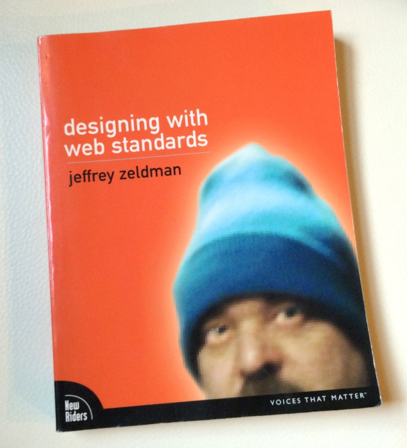
Jen's original copy of Designing With Web Standards, purchased in 2003, lugged from apartment to apartment for 12 years. It always makes the cut, surviving periodic book purges.